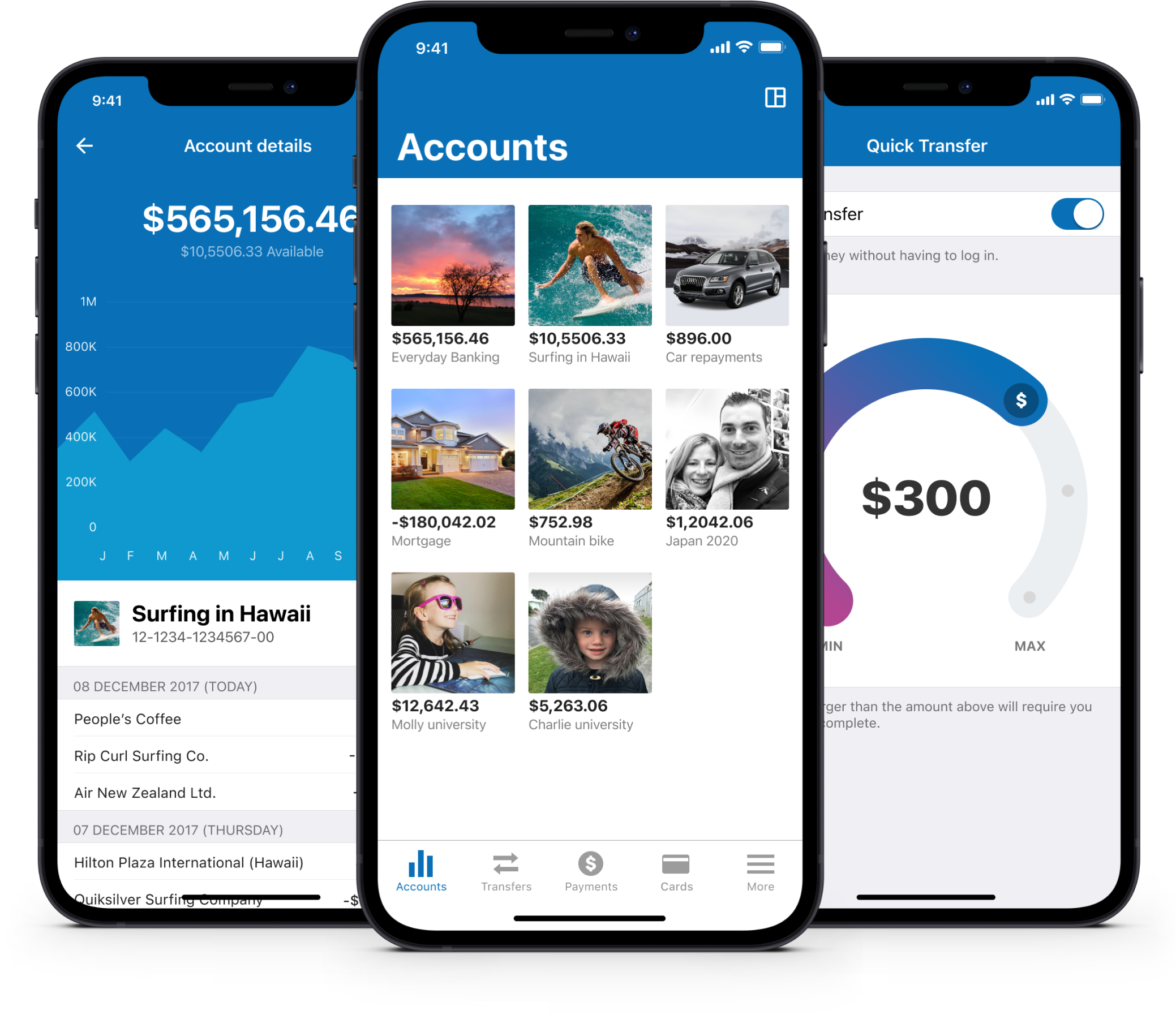
Core banking app
Simplifying the everyday banking experience (balances, transfers, payments, and cards) to create a minimal, transparent and informative mobile banking app.
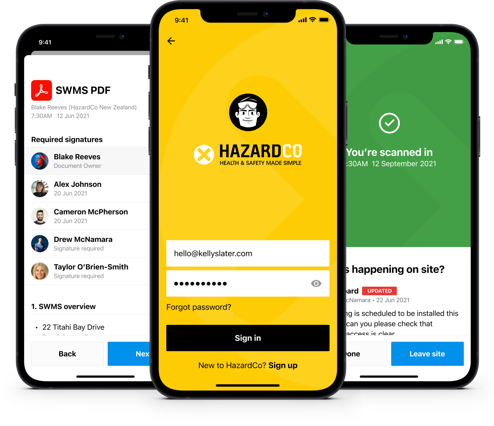
Worksite health & safety app
A simple, guided health and safety system. Create reports, assign tasks, see who’s on-site, monitor the performance of your building project. Access to all your construction health & safety information, right in your back pocket.
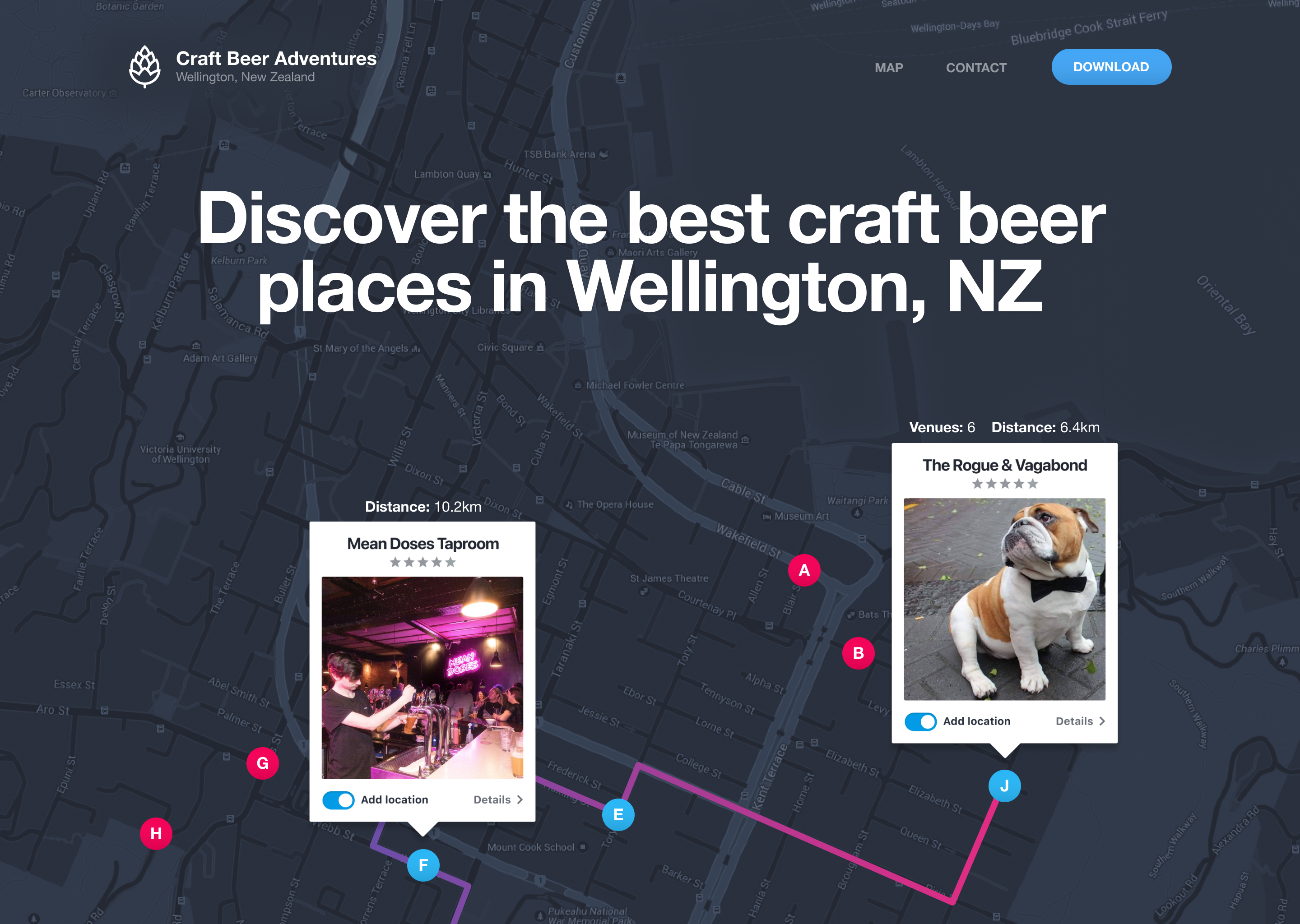
Craft Beer Adventures app
An interactive map which allows you to explore some of the best craft beer places in Wellington, New Zealand with your friends. The app automatically calculates the optimised walking routes to help ensure your adventure is a success.
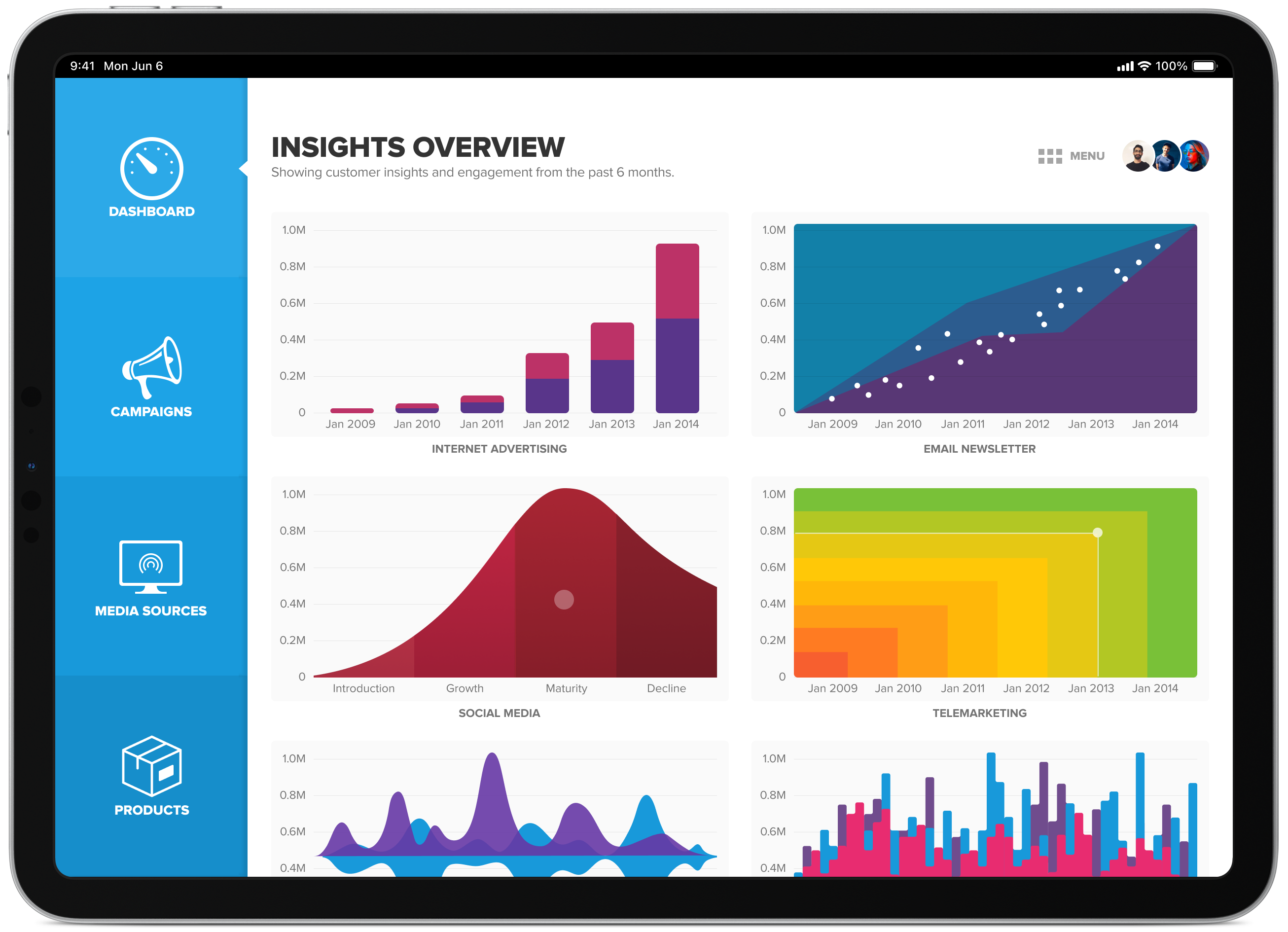
Social marketing dashboard
This social marketing and data analytics dashboard collects data from various marketing/media avenues then presents it in a detailed, easy-to-use and highly graphical user interface. Bright colours were used to invite user-interaction.
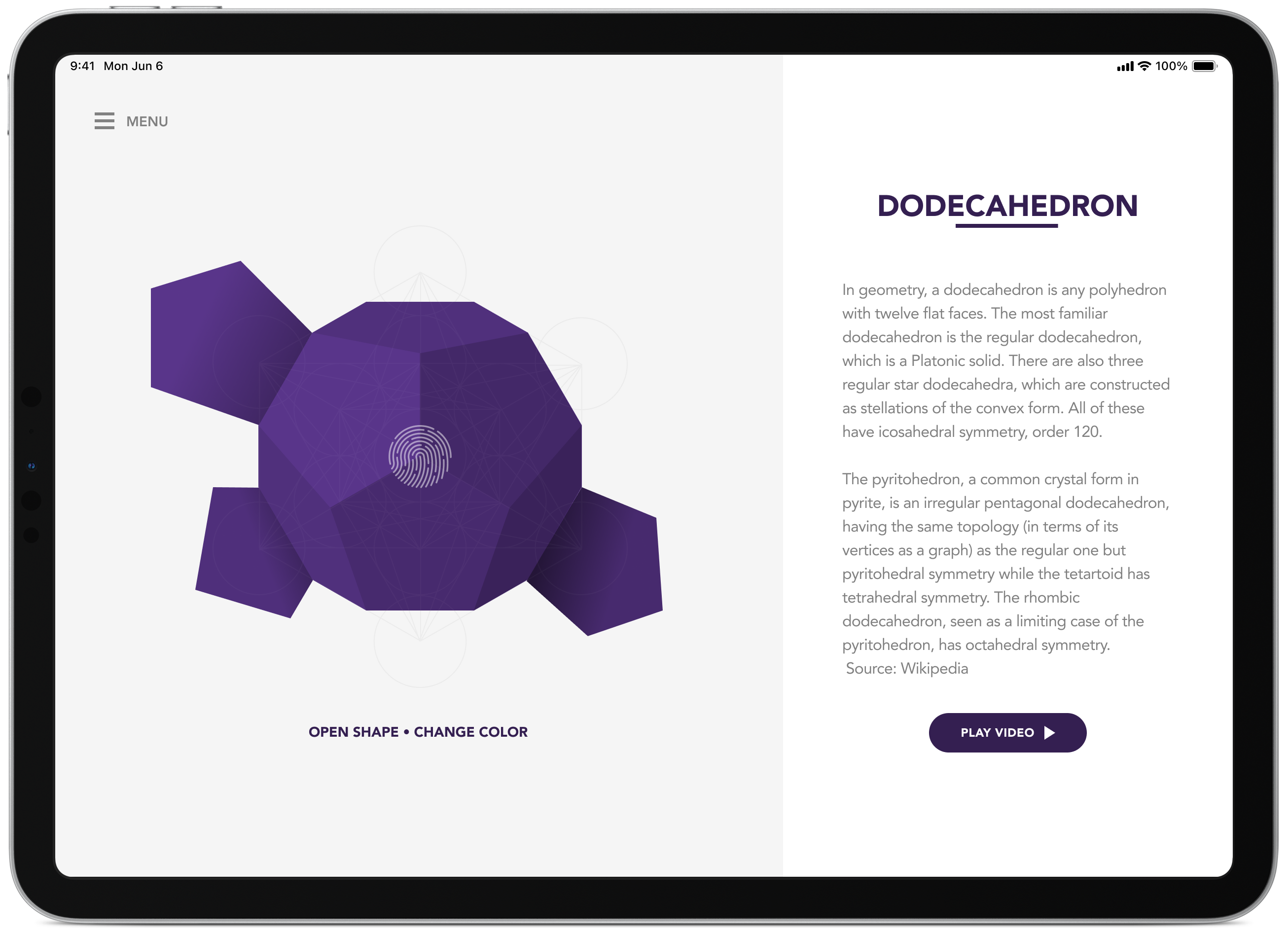
Metatron's Cube origami app
An iPhone/iPad app which guides you through the process of making an origami Platonic solids based on Metatron’s Cube.
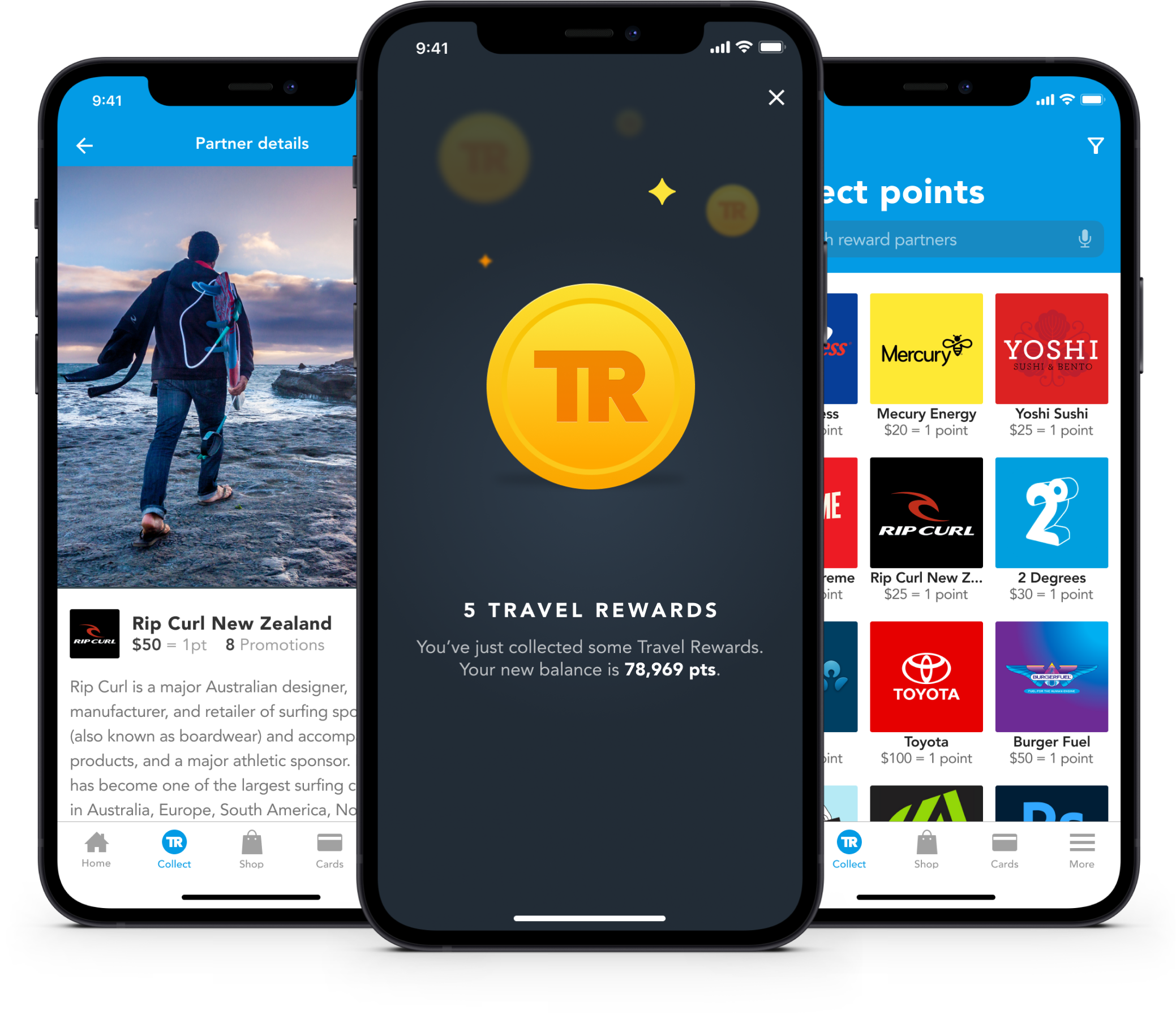
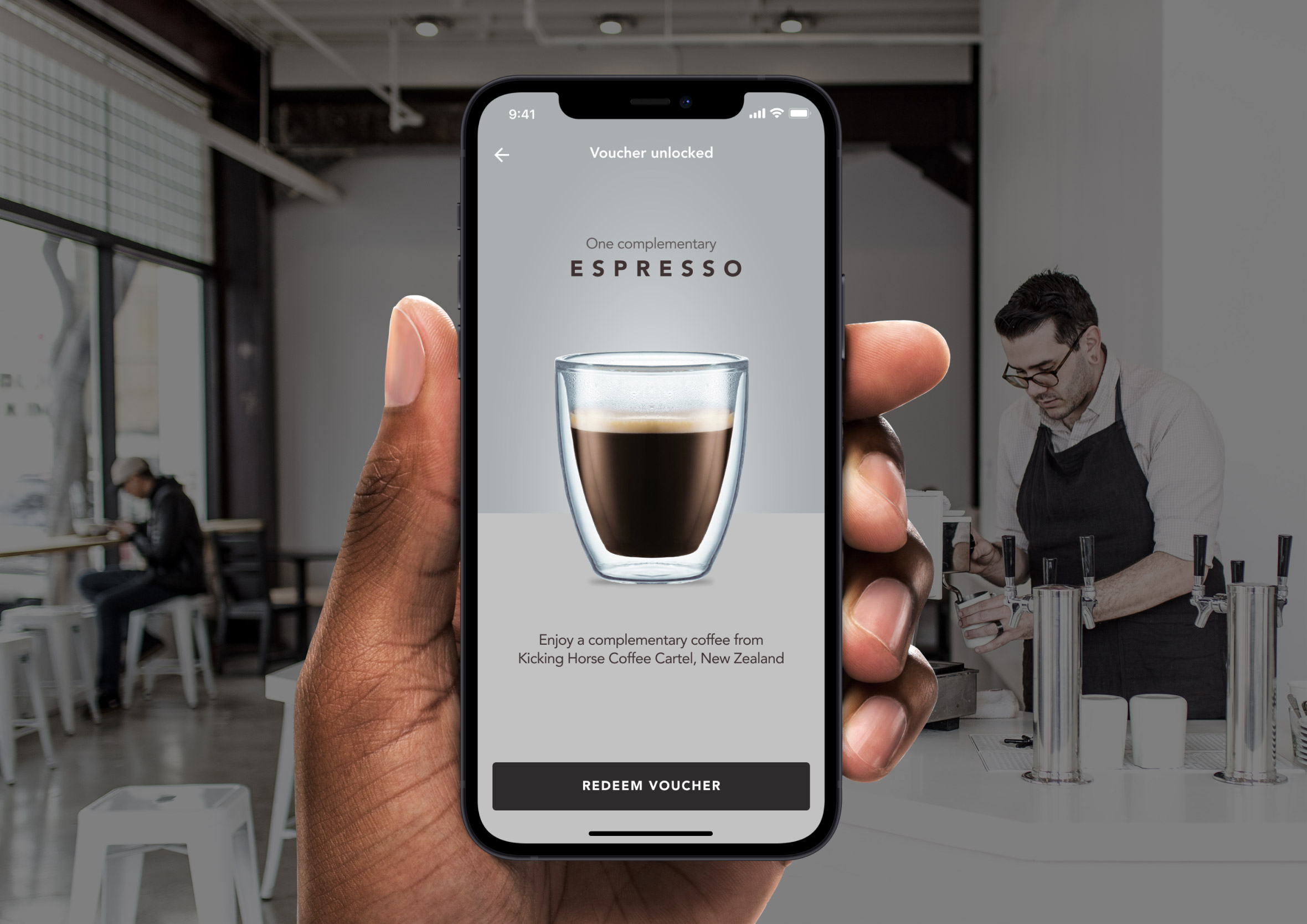
Travel rewards app
Earn Travel Rewards points to do things you really want to do. Experience new destinations and purchase travel products to enhance your trip. You also have the ability to have all your loyalty cards stored digitally reducing the number of cards you have to carry on you.
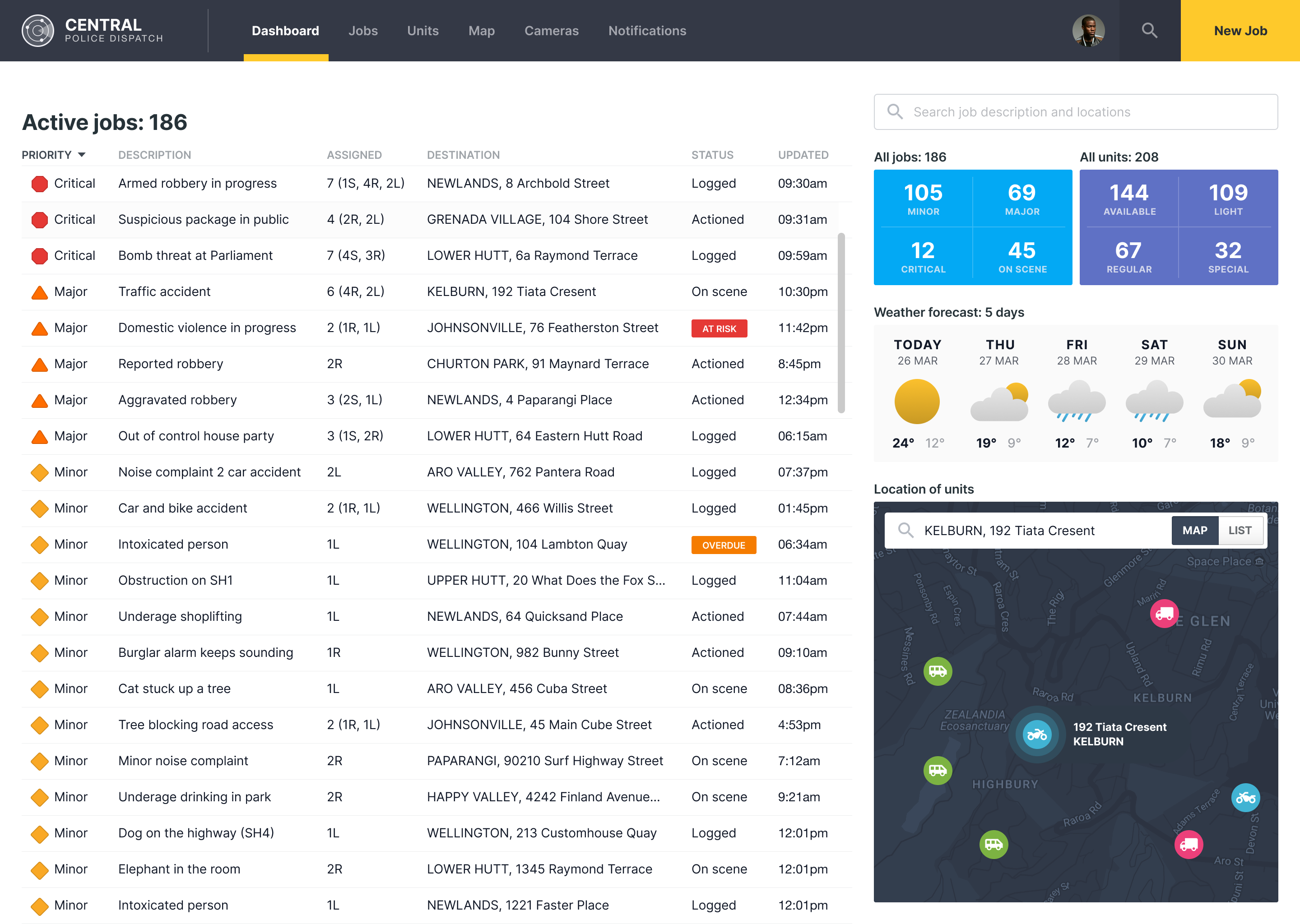
Police dispatch dashboard
Real-time dashboard designed to help Police manage calls and coordinate their resources in response to emergency calls.
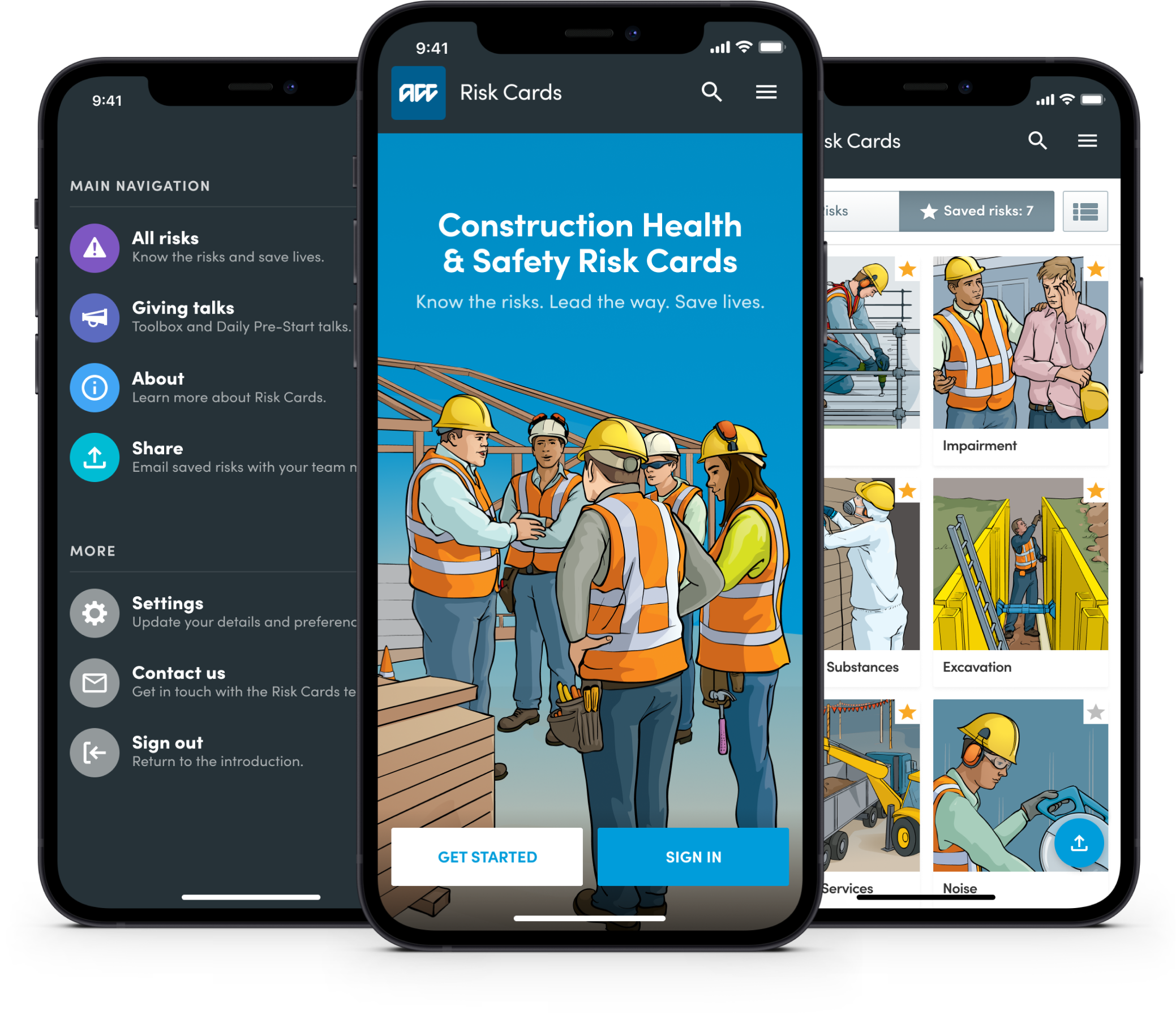
Health and safety risk app
A web-based health and safety app for the construction industry to help run toolbox and daily pre-start talks. A great way to upskill workers and onsite reference tool to help educate and keep people safe. Illustrations by Ocean Design.
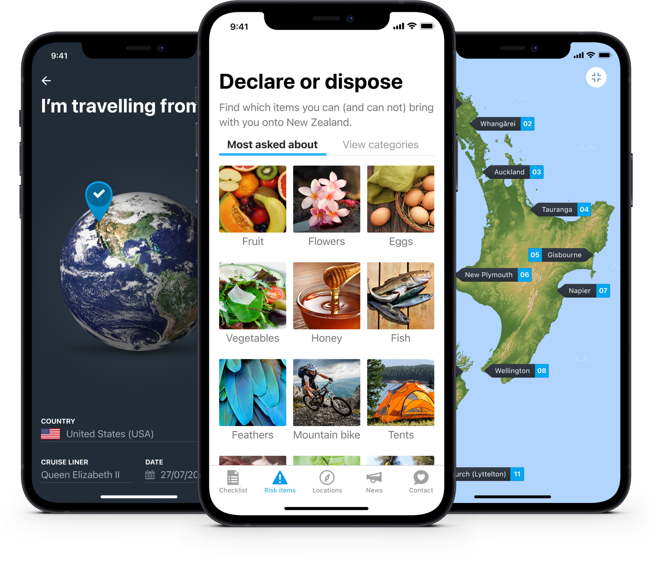
New Zealand travel app
The app is based on the physical passenger arrival card people fill out when they enter the country with the intention of time educating people about what items they can bring with them into New Zealand. The app is designed for travellers to ensure they have an awesome trip and are made aware of New Zealand’s strict biosecurity laws.
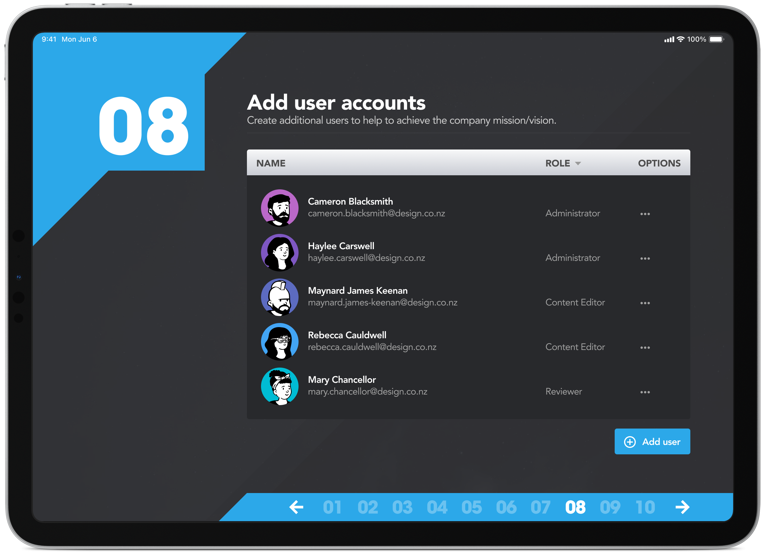
StrategyBlocks onboarding
A complete redesign of the UI/UX for the for StrategyBlocks online registration and onboarding process. The 10 steps help guide people through the initial sign up process, explain some of the important (sometimes complex) principles of strategic management while providing a better understanding of how the product works. The challenge is making the complex simple.
Custom weather app
Build and customise a simple (and responsive) weather widget to display up-to-date forecast information on your website.
100 Days of Design Challenges
I want to become a better designer (by design faster and generating better quality ideas) so I’m currently completing the Daily UI Challenge. Over the next 100 days I will design something new each day.
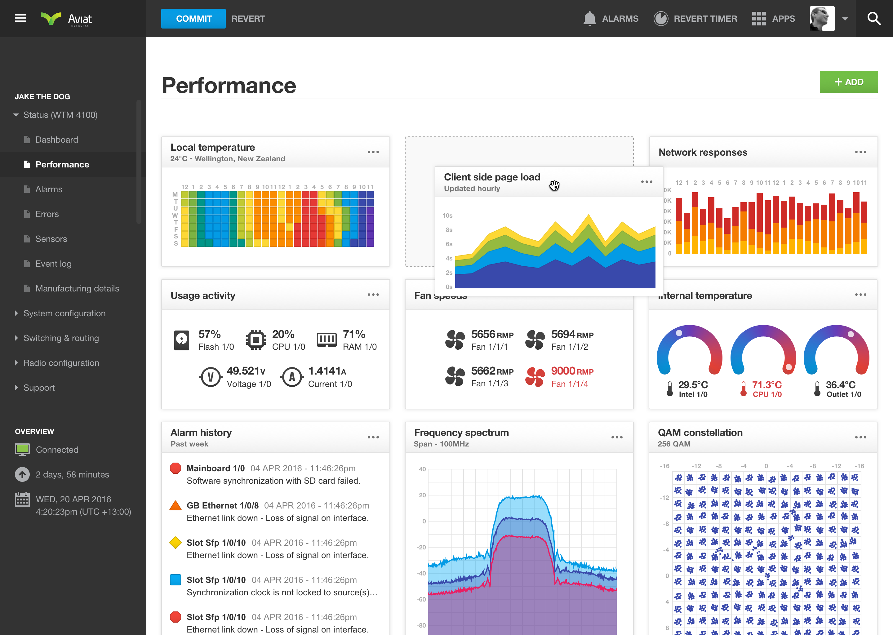
Networking dashboard
A web-based dashboard and diagnostic tool which allows network technicians to easily configure and monitor networking hardware.
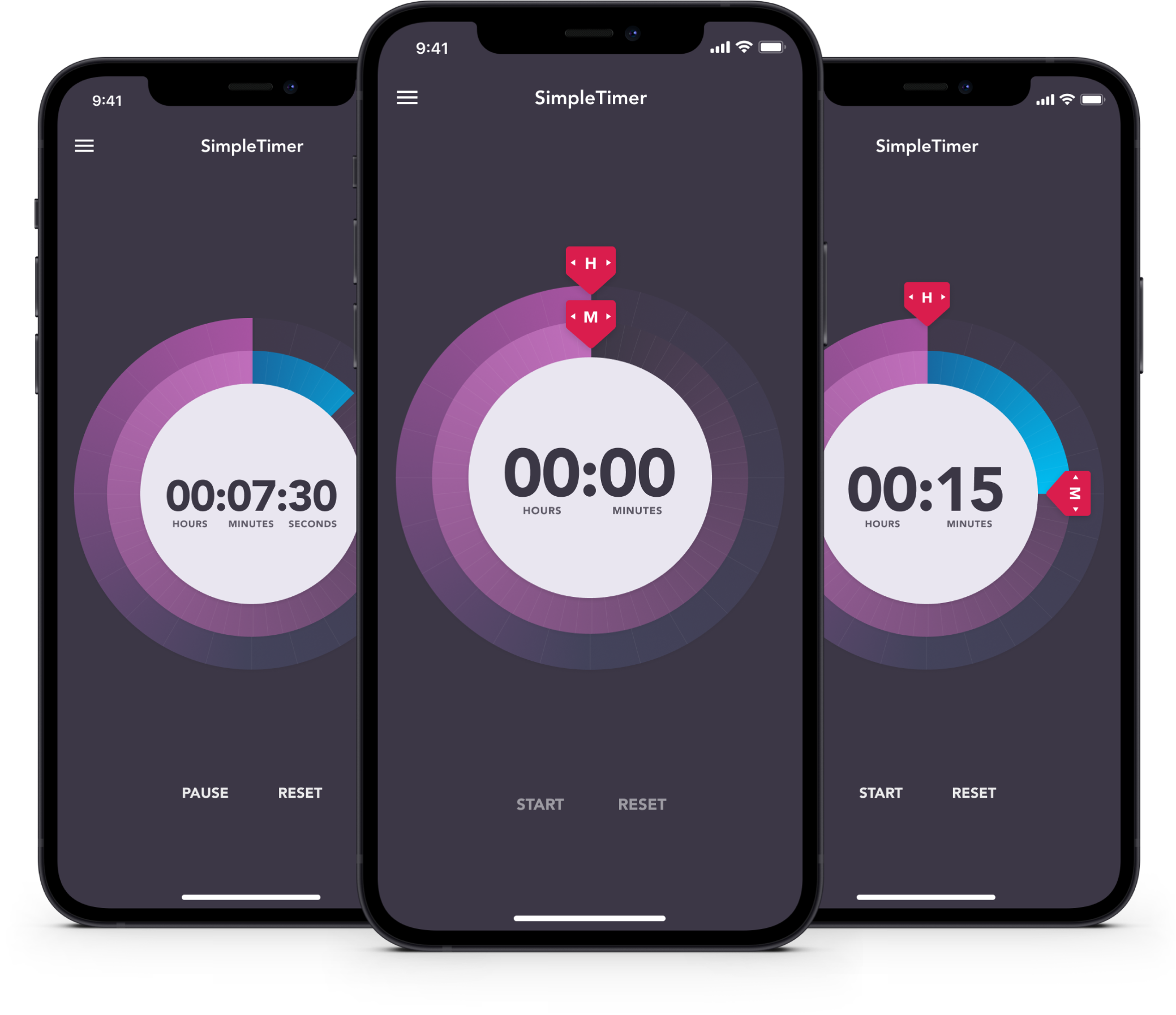
SimpleTimer iPhone app
A simple timer and which lets you quickly set a reminder so you don’t get preoccupied searching for kittens on the internet. Inspired by an everyday product, I was inspired to see if I could reimagine the design into something completely different.