Here’s the concept I came up with when designing a logo for a coffee company. I’ve also included some background to better explain my thought process behind the design.
Design process:
I wrote an article about my design process I use to produce work I’m proud of.
- Start with a brief
- Establish a timeframe
- Initial sketching
- “Digital scrapbooking”
- Dribbble
- Resketch initial ideas
- Set-up the document
- Get feedback early
- Explain yourself
- Reiterate, polish, deliver.
Brand components:
- Image
- Company name
- Established date (to give a feel of authenticity)
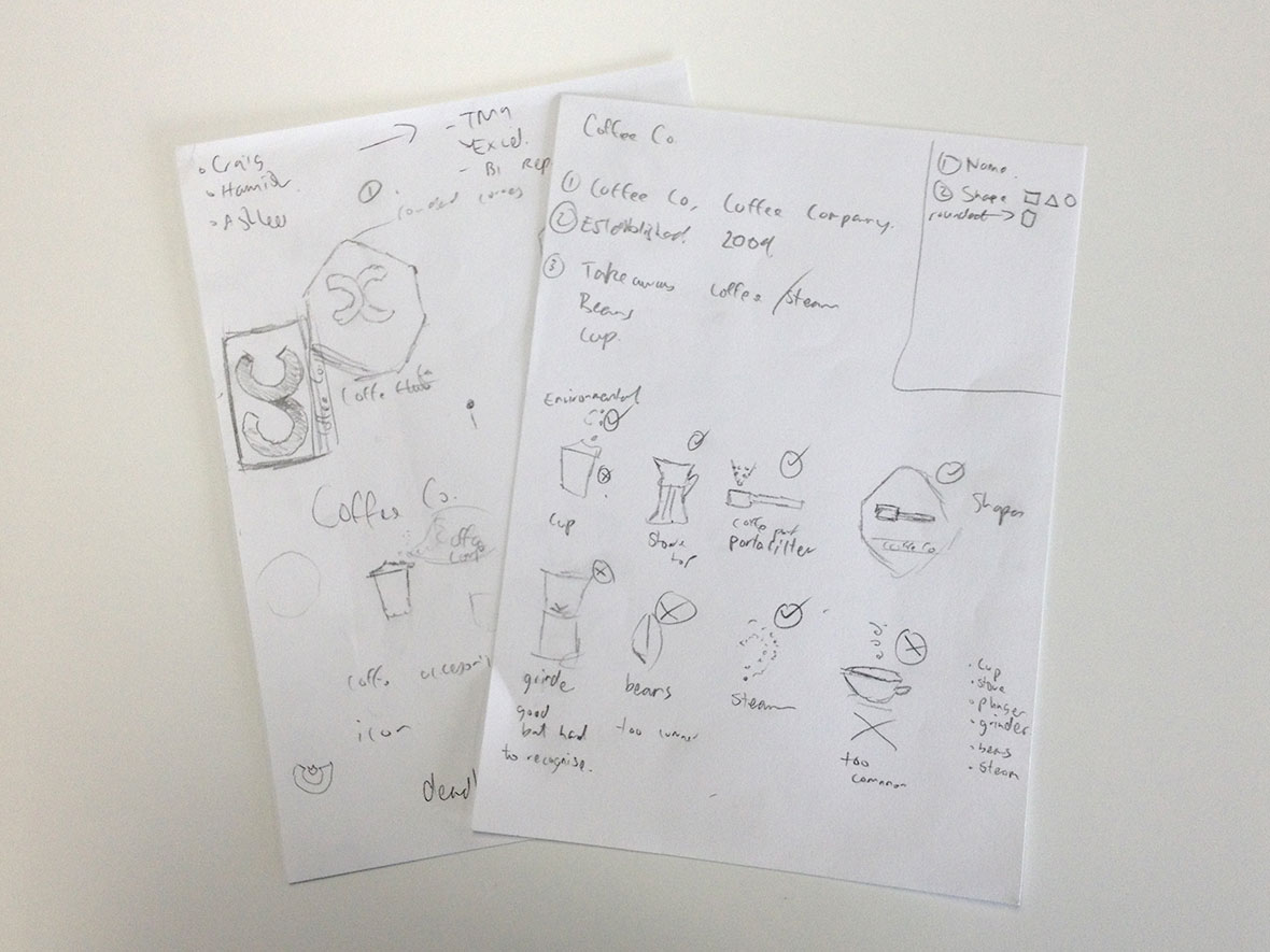
Logo ideas:
- Take away cup: Disposable, unfriendly, throw away solution
- Cup: Overdone, could be anything (soup, tea, etc)
- Portafilter: Not an easily recognisable object
- Beans: Overdone, not original enough
- Grinder: Not an easily recognisable object
- French press (plunger): Elegant look, doesn’t produce a clean end result
Logo winner:
- Stove-top Espresso: Reliable, friendly, social (share it with more than one person), go through a process to get an outcome.
- Steam: Freshly made, ready-to-enjoy, inviting.