A few years ago I was researching layouts and grid structures on the web when I stumbled across this awesome article written by Pierre Marly from Teehan+Lax – Designing Faster with a Baseline Grid.
I’ll admit when I read first this blog post I’d never heard of the term baseline, all that would change. Pierre’s words or wisdom had a lasting affect on my approach to design. Years later the principles (and a few others ones I’ve picked up along the way) I learned are still at the core of my design process today. Here’s my approach when it comes to baseline grids:
Traditional Typographic scale
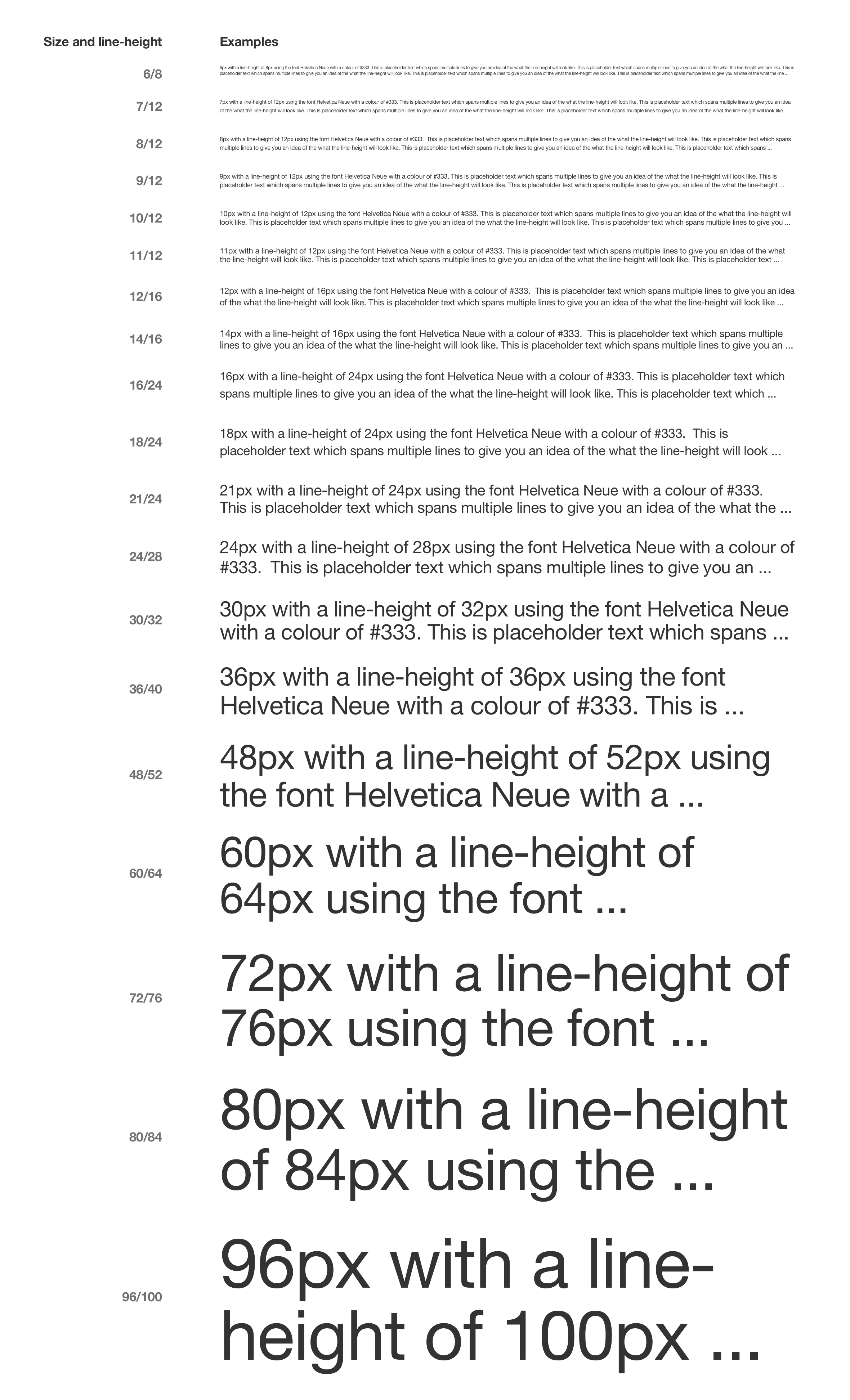
Typography is the foundation of great design. Where ever possible I like to make use of the traditional typographic scale (6, 7, 8, 9, 10, 11, 12, 14, 16, 18, 21, 24, 30, 36, 48, 60, 72, 80, 96) as mentioned in Robert Bringhust’s book The Elements of Typographic Style. It’s a great way to establish a clear hierarchy and vertical rhythm for your project.
Note: I’ve added 30px as it’s a huge jump between 24px and 36px :)

Set type to use a 4px baseline grid
A 4px baseline grid provides the consistency and flexibility to design for both web and mobile without having to rethink about different measurements.