What is Core Banking?
At its heart, Core Banking is everything you need daily and nothing you don’t. It was designed from the ground up to be super fast and to strip out anything deemed necessary for everyday banking. Everything you need, nothing you don’t!
Concepts, brainstorming & sketching
When I’m beginning a project and capturing ideas I prefer to go low-fidelity and sketch ideas with pen and paper to generate as many concepts as possible. Exploring high-level concepts before investing too much time in the design phase. From there, I will either produce wireframes or jump straight into the design and rapid prototyping process to validate ideas and assumptions.
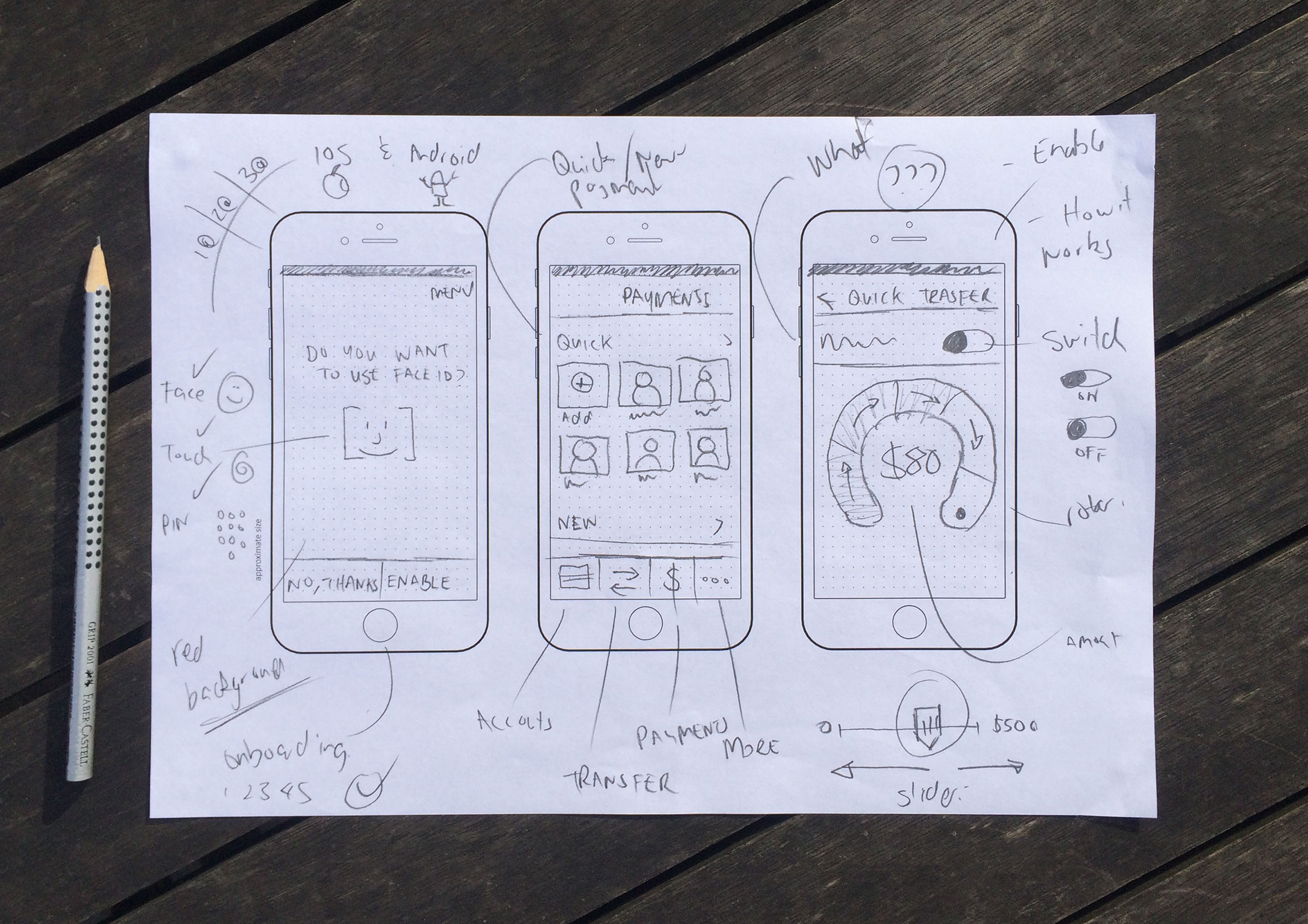
Wireframes to test user flows
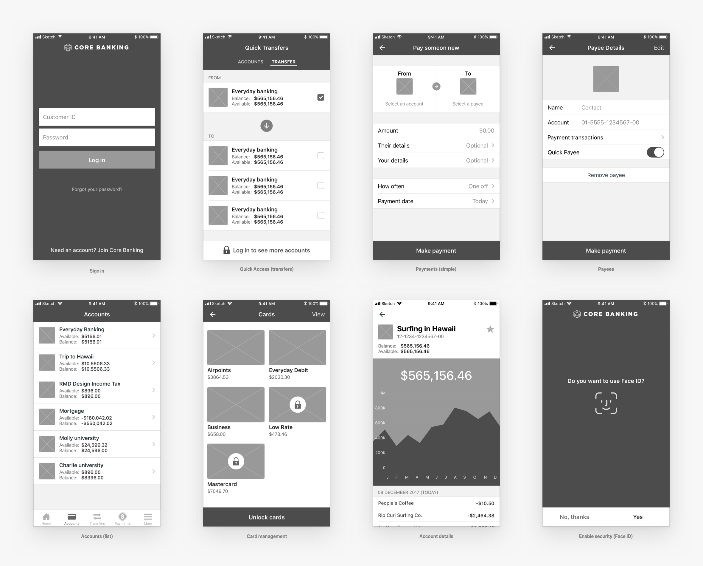
Once I have a few concepts I want to push further and test out I will create simple wireframes to see how the screen interact and help inform user flows.
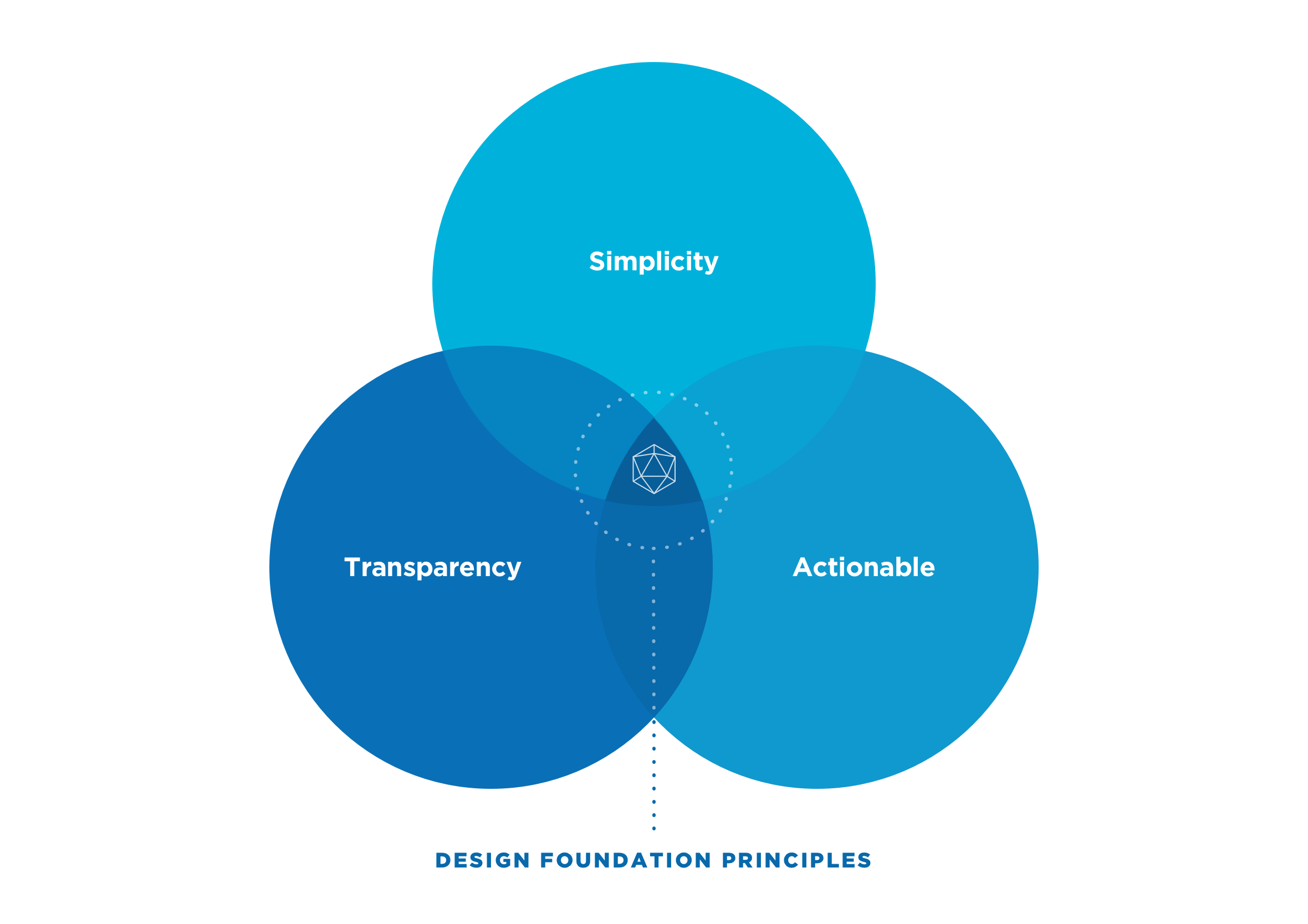
Clearly defined design principles
At the beginning of the project, we agreed on 3 basic design principles to act as our “North Star” when designing the user experience. We wanted the app to be easy to use, transparent (clear information on fees and interest rates), and improve people’s financial literacy by making them feel informed and empowered with their personal finances.
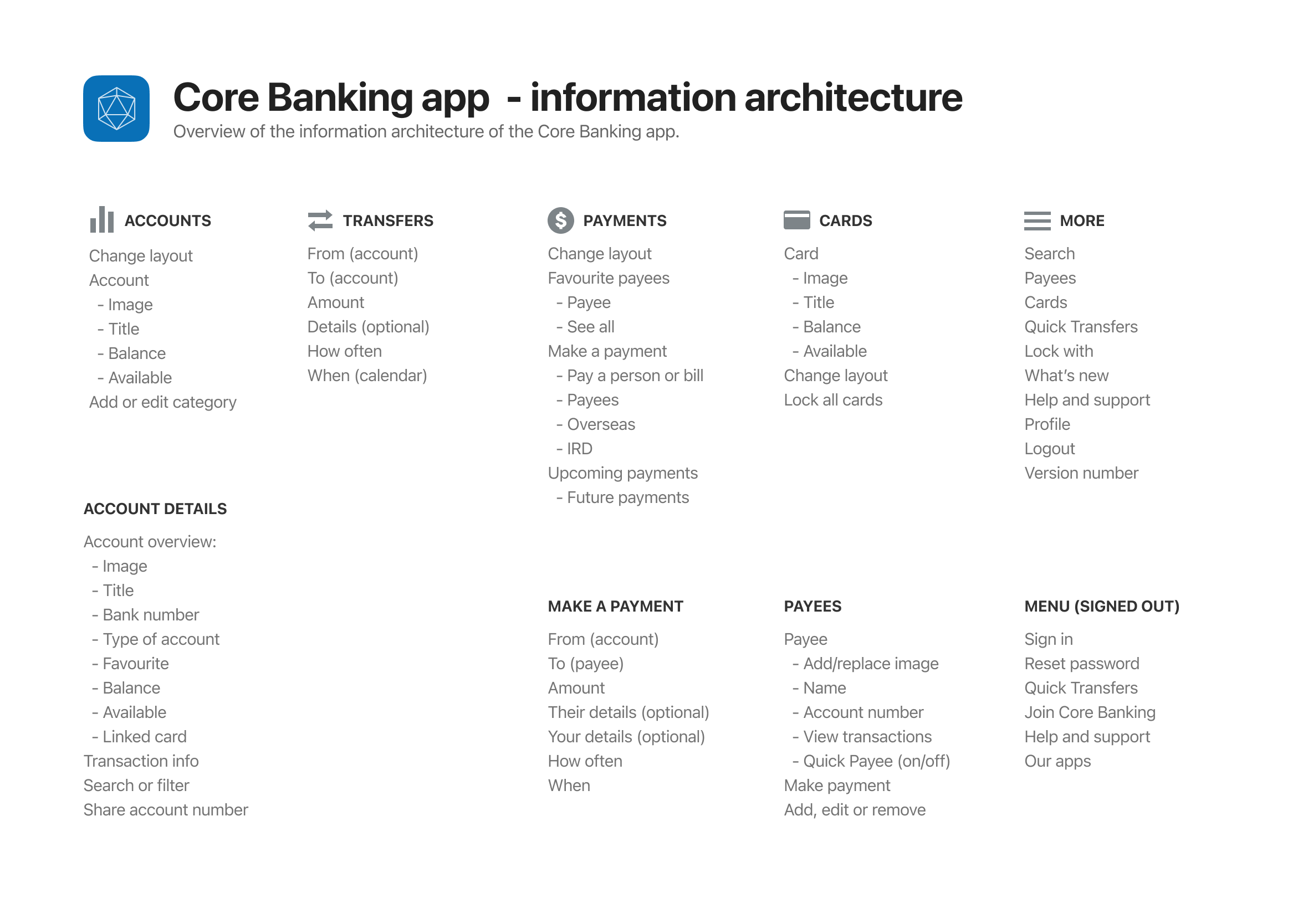
Information architecture
The information architecture maps out which screens are required and all the user interface elements which make up the structure of the app. By having everything in the one place it makes it easier to identify areas of improvements or gaps in the user experience.
Usability testing & user interviews
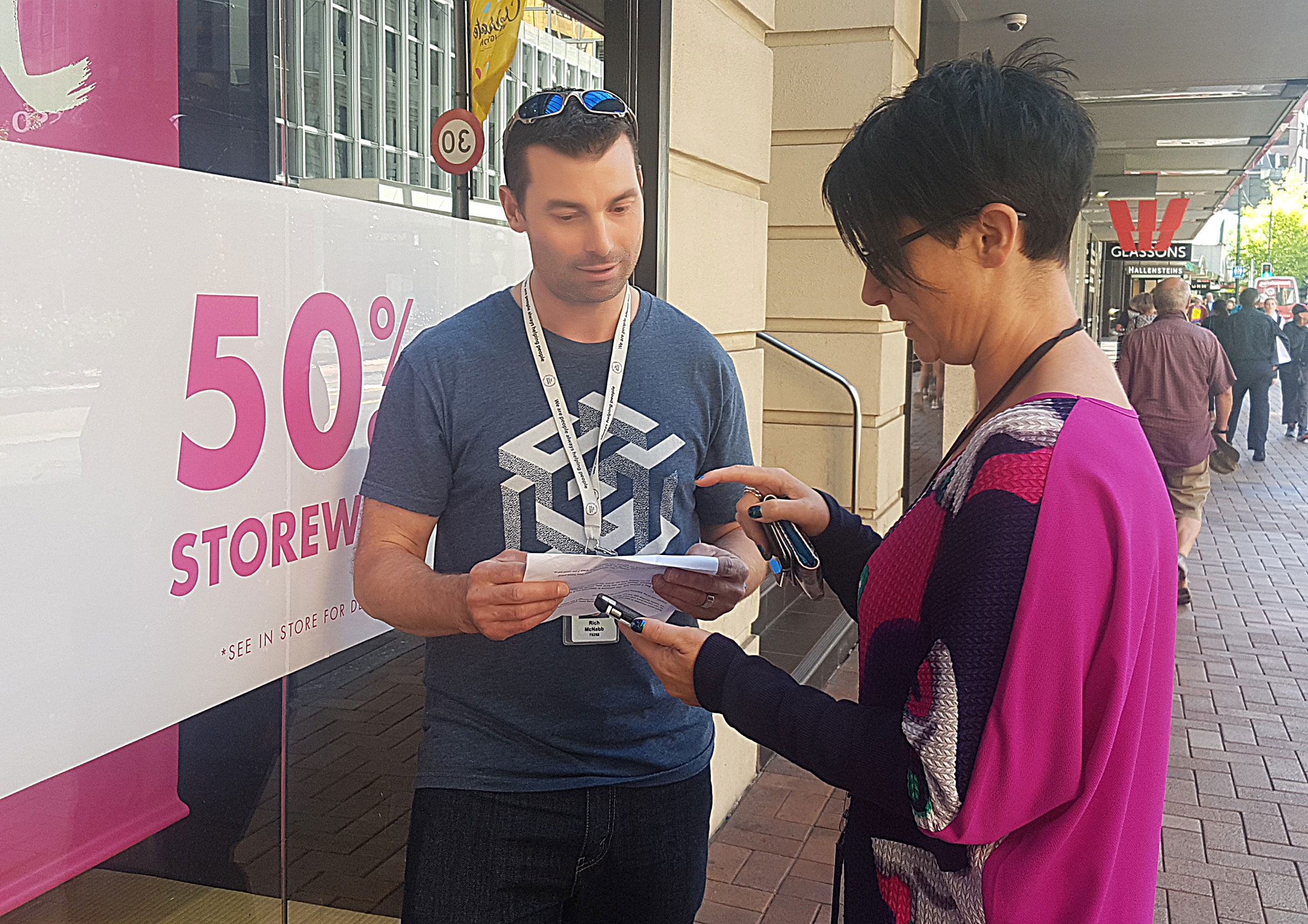
Regular usability testing cycles were completed throughout the project. The majority were done in the office in a question and/or task-based scenarios to get customer insights and to validate assumptions and concepts. To validate smaller design decisions, we went out with a digital prototype, a small list of questions and chocolate to carry out guerrilla testing on the streets of Wellington, New Zealand.
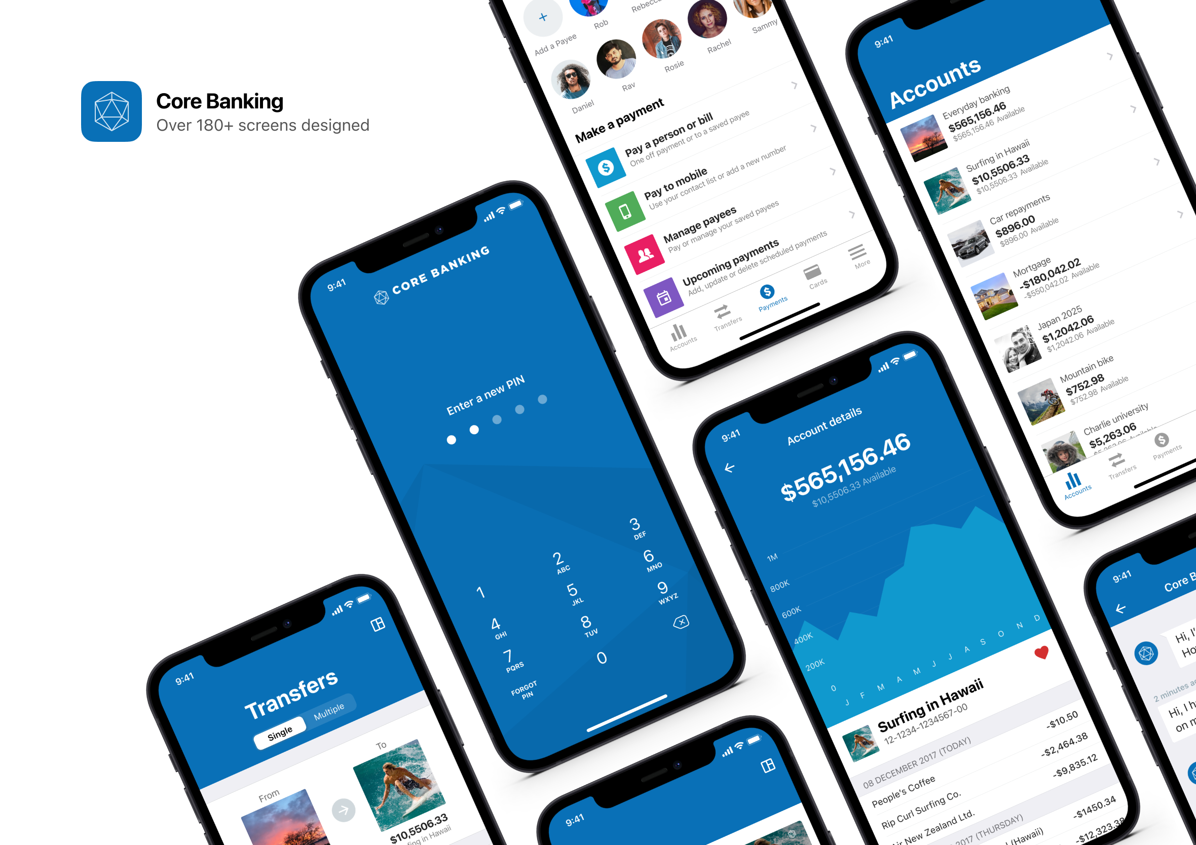
More than 180+ screens
Over 180 unique screens were designed for the Core Banking mobile banking app… that was just for iOS! Additional screens were duplicated for Andriod users.
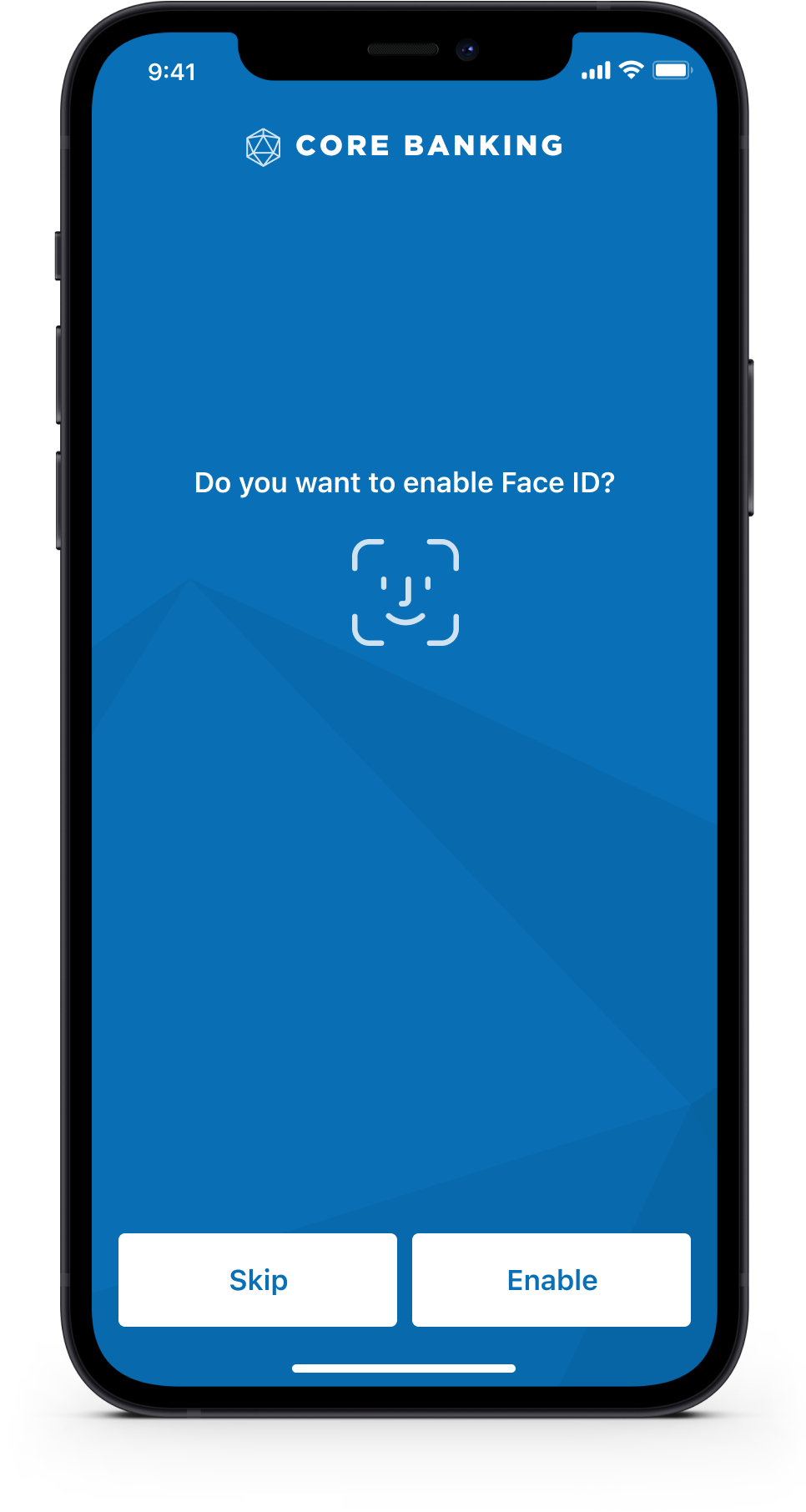
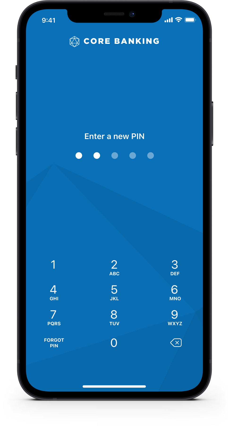
Improved speed to log in
By improving the speed at which people can log in helps them to carry out quick everyday banking tasks. We included support for Face ID or Touch ID (also known as biometrics), PIN and falls back all the way to username/password.
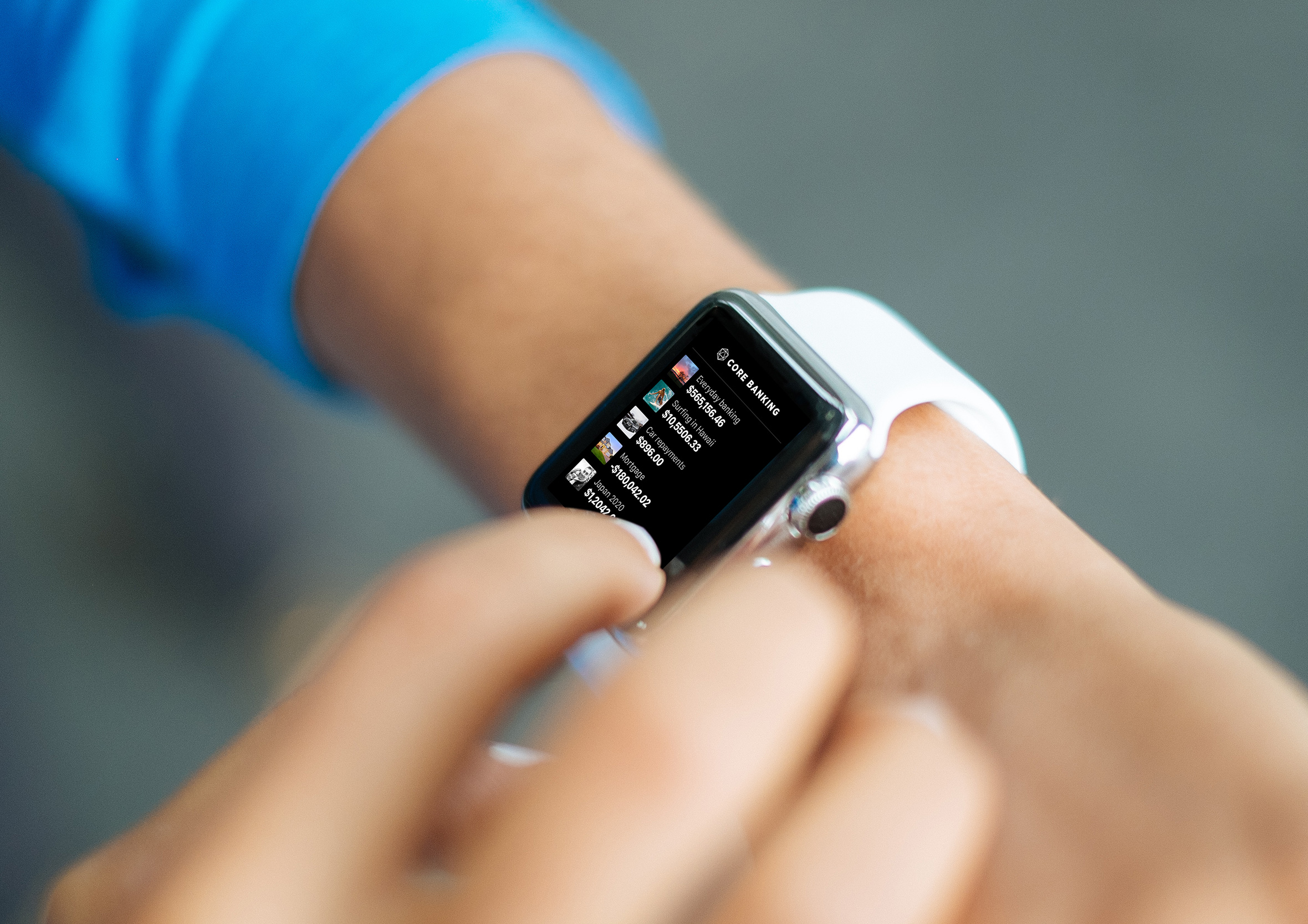
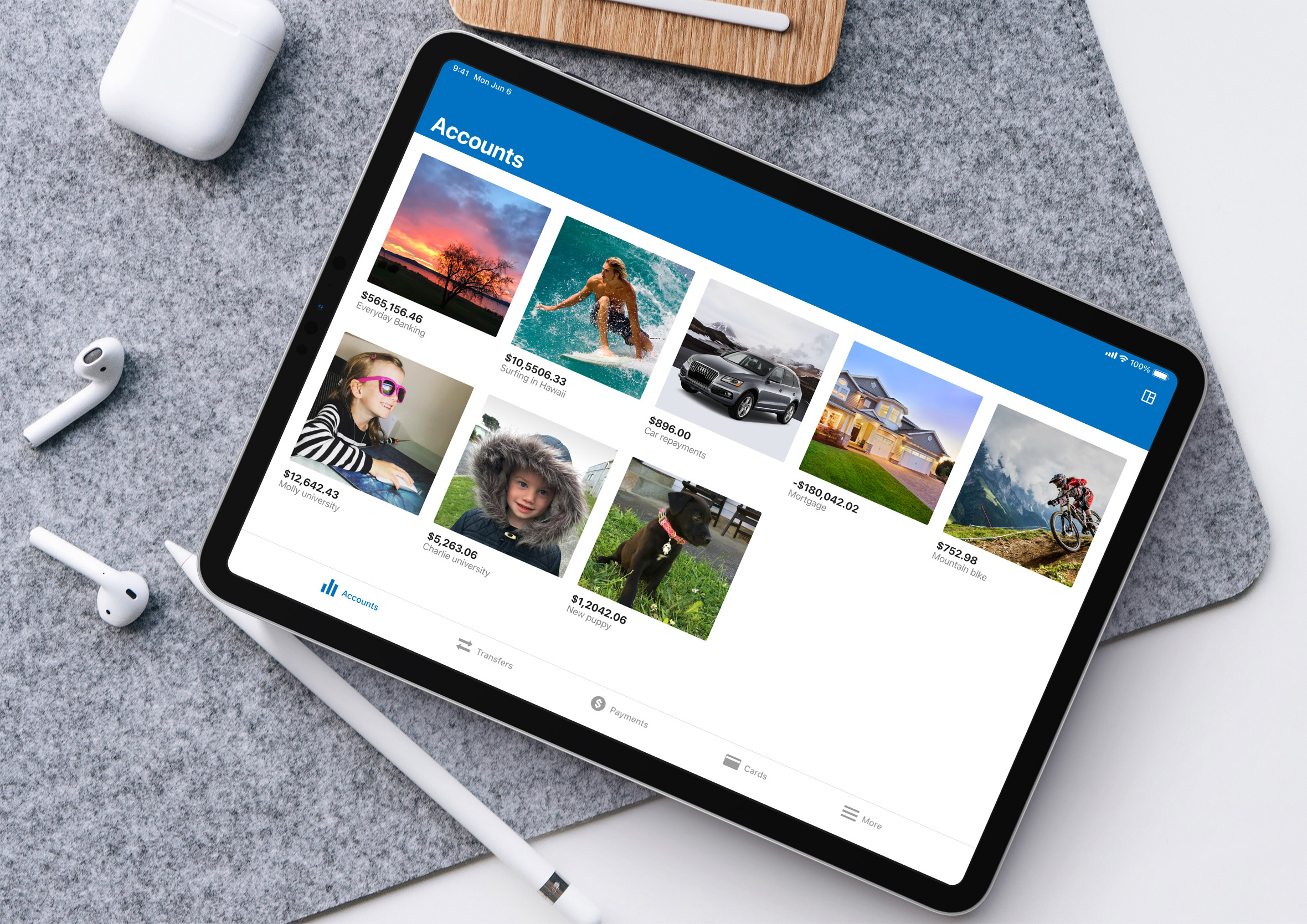
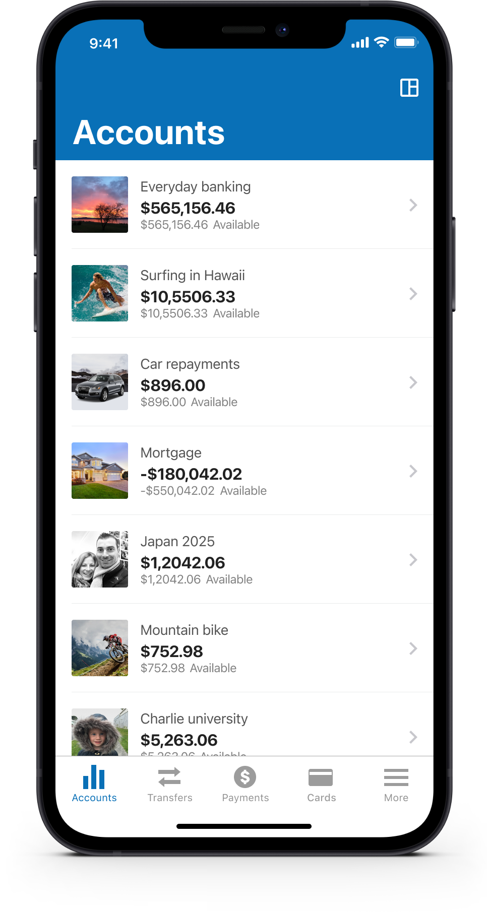
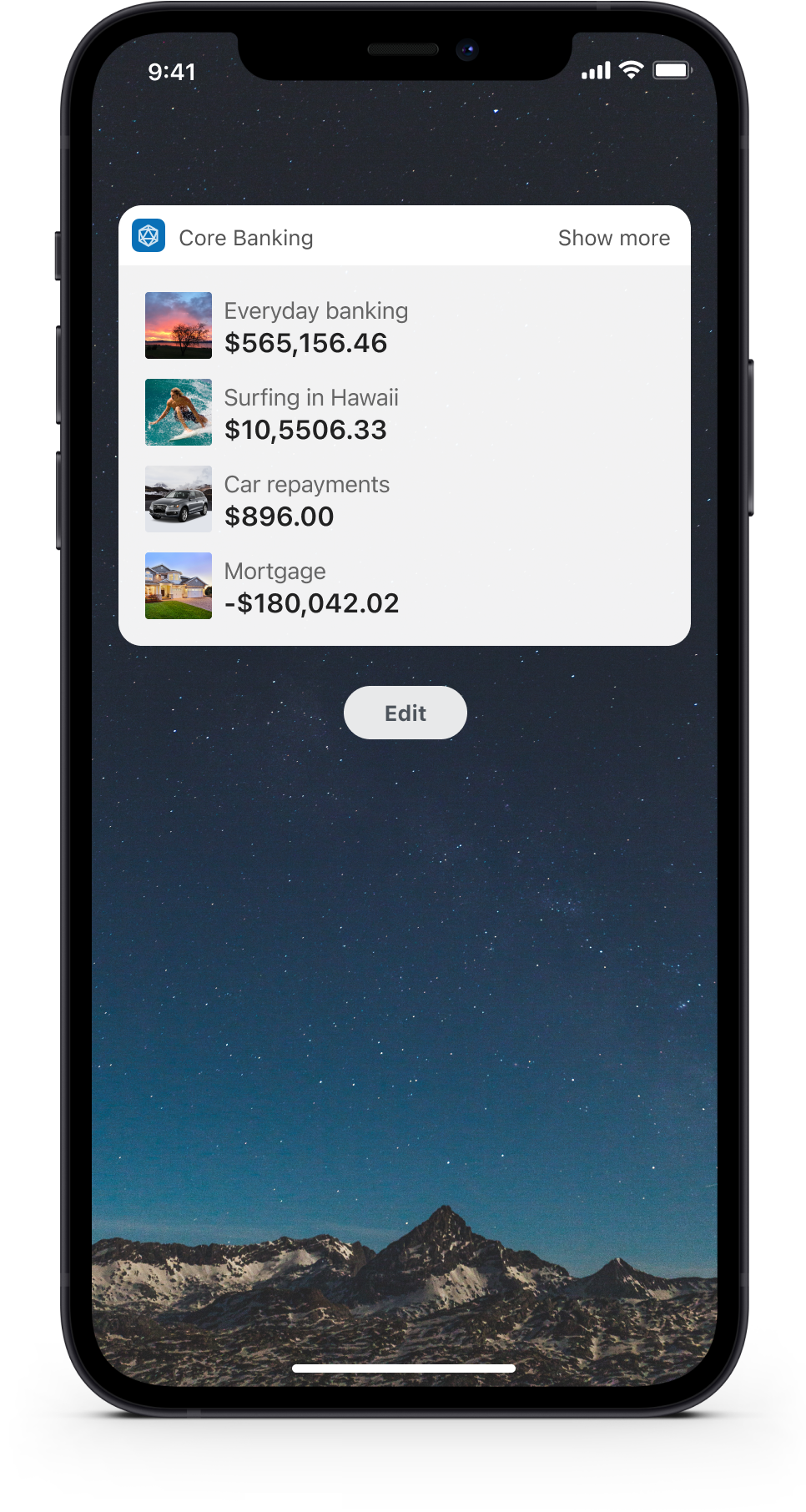
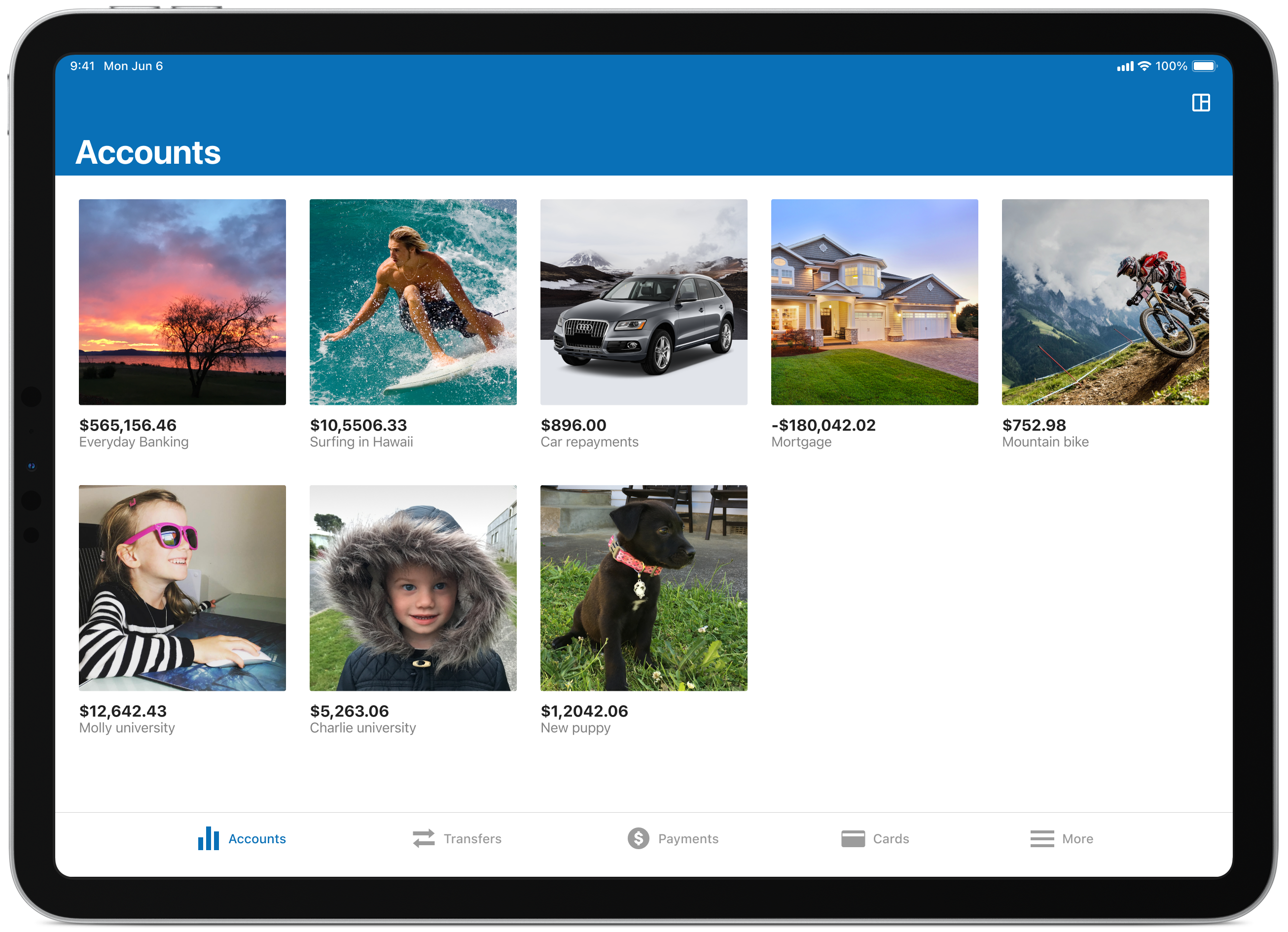
Customising the accounts view
By allowing the user the ability to customise certain aspects of the app we give them a little more control over the information they’d like to see and choose which layout they prefer. Options include; the ability to re-order their accounts, change the view and select if they’d like to see both balances and available balances.
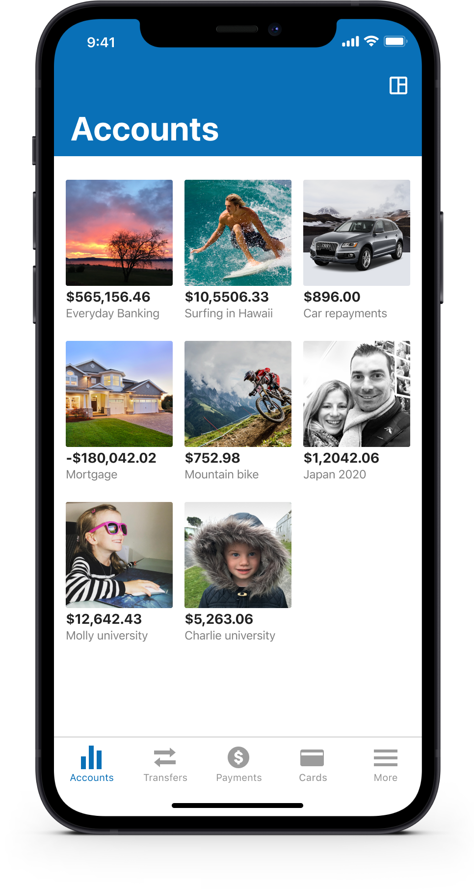
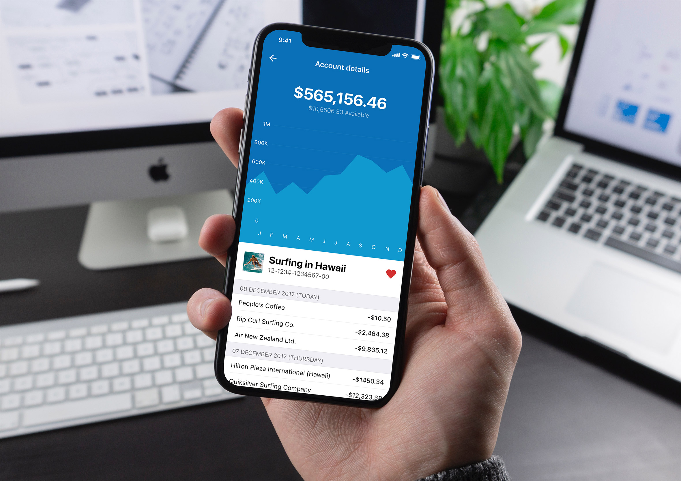
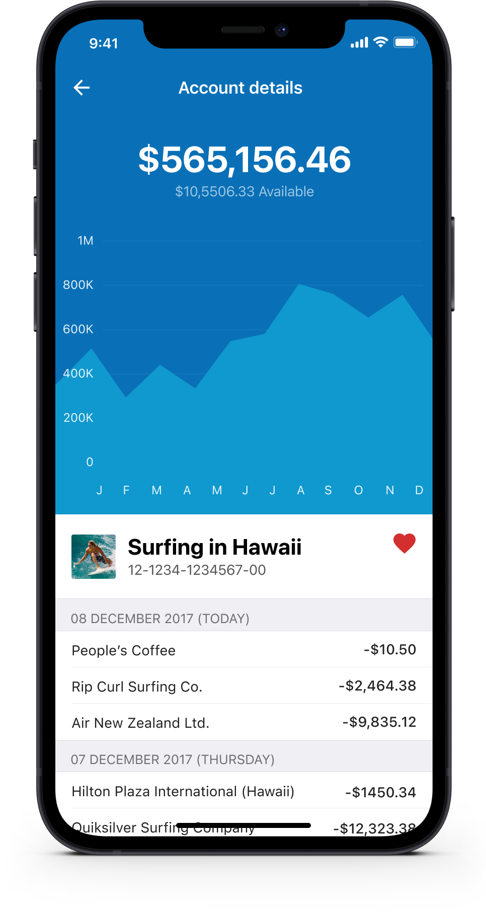
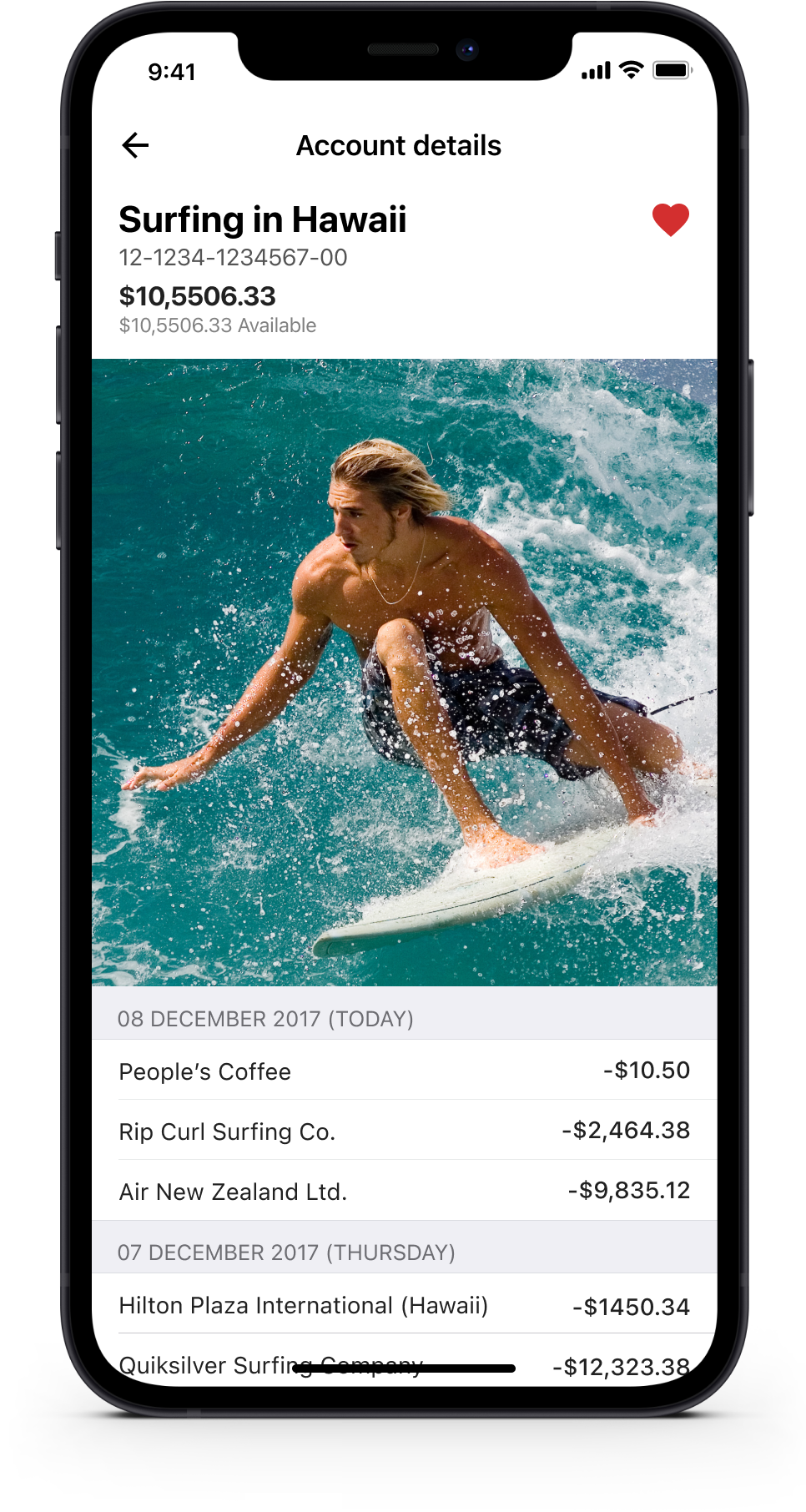
Graphs and images motivate
From here we looked at large imagery (goals and/or moods), data visualisation and the ability to select accounts you deal with more frequently so they are easier to locate and interact with. Graphs give a great indication of how well you’re tracking and imagery is a constant reminder of the financial goals people are working towards.
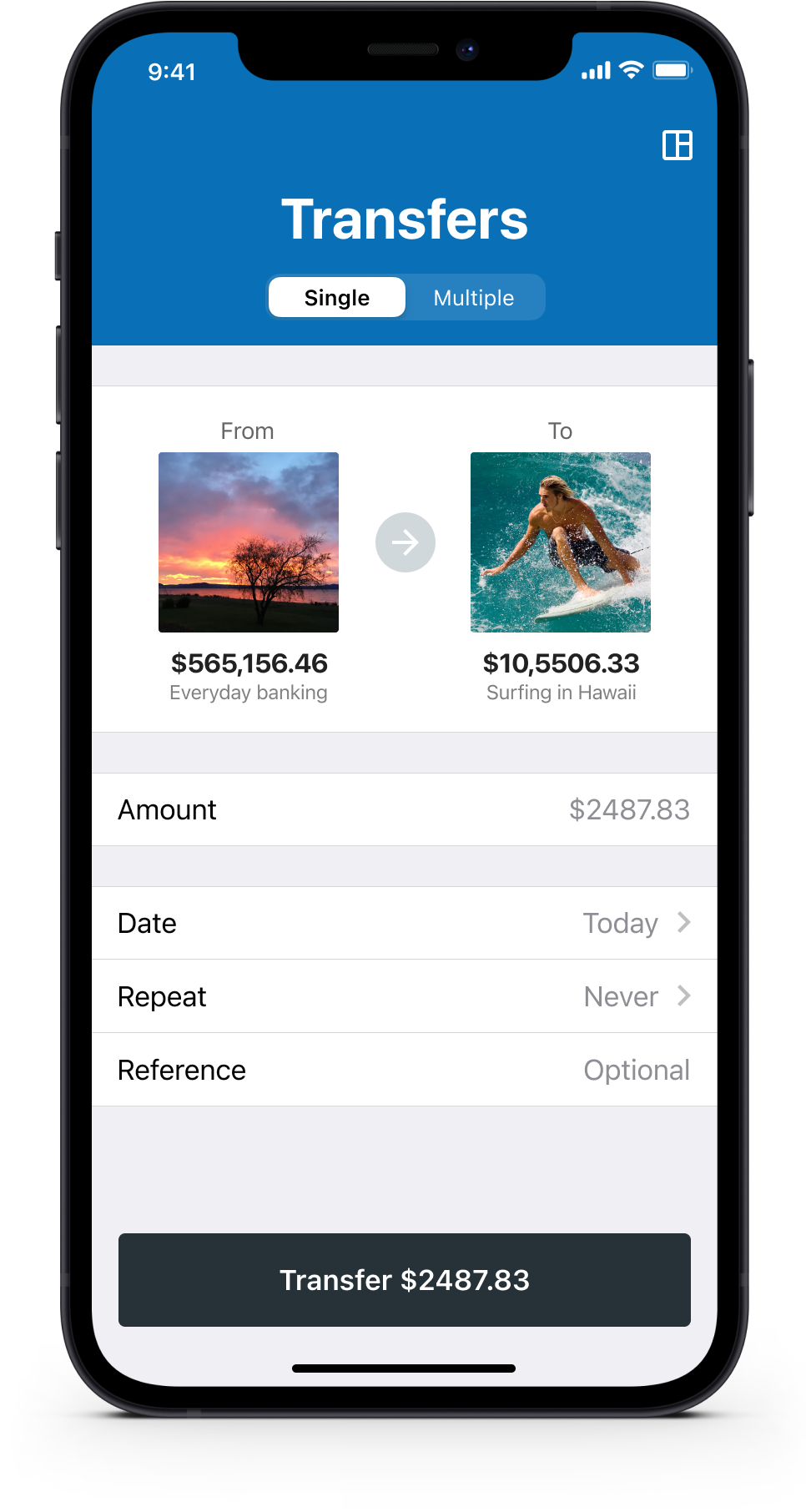
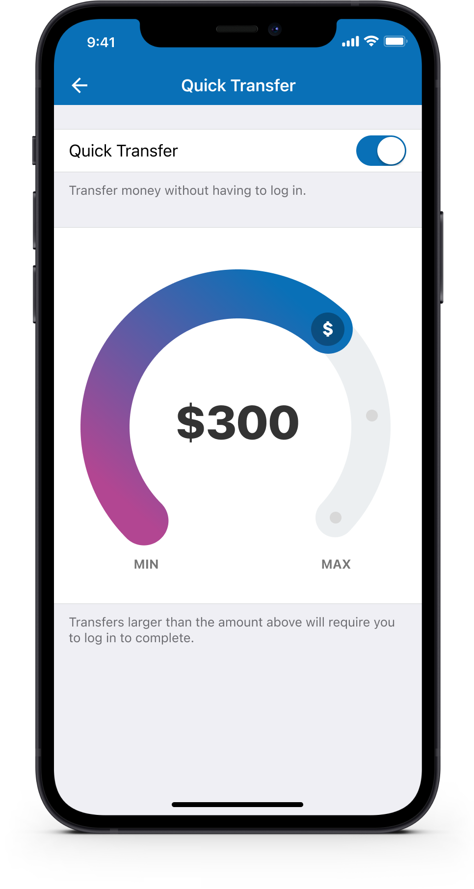
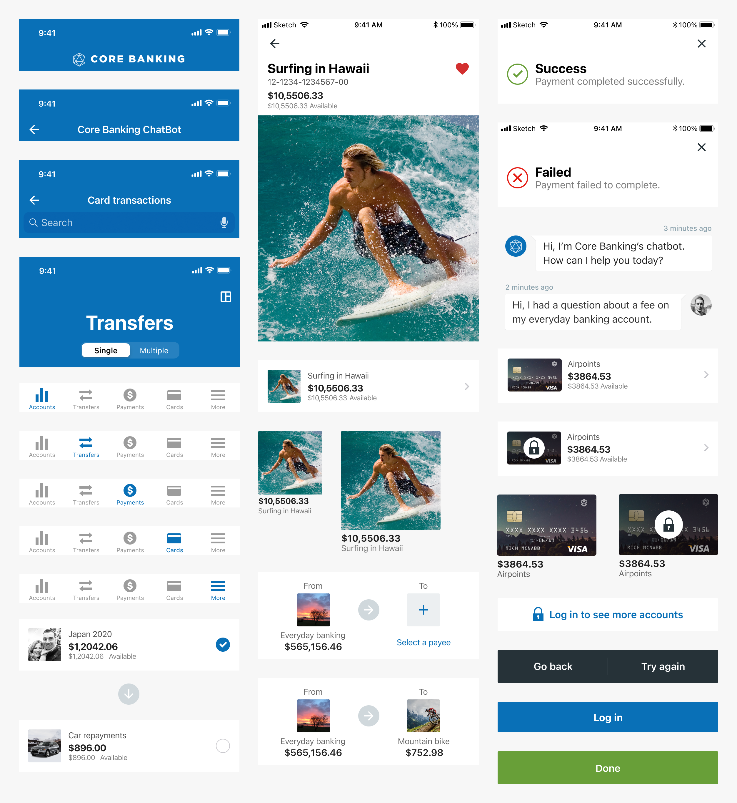
Quick transfer and multiple transfers
Users can quickly transfer money between accounts without having to log in if they choose. Also, they can complete multiple transfers (bulk transfers) from one account in one hit.
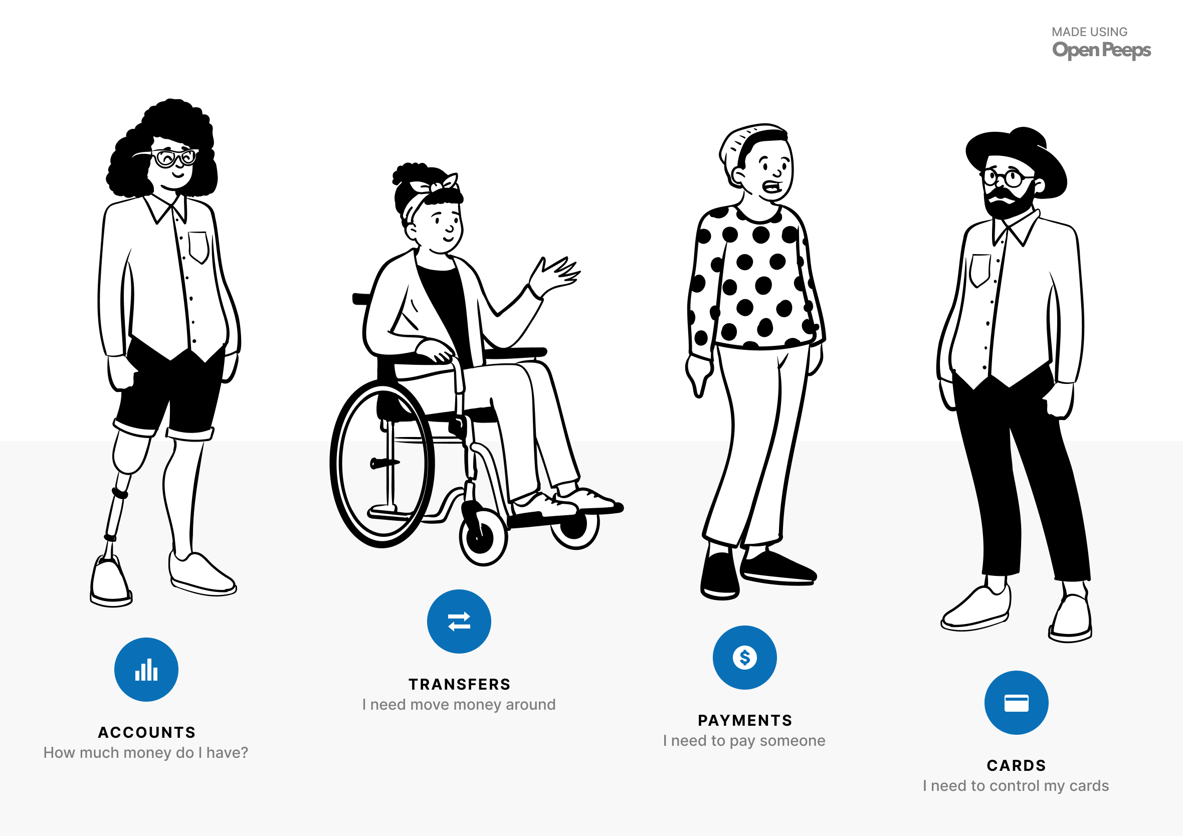
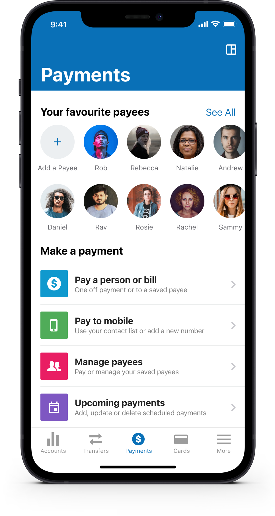
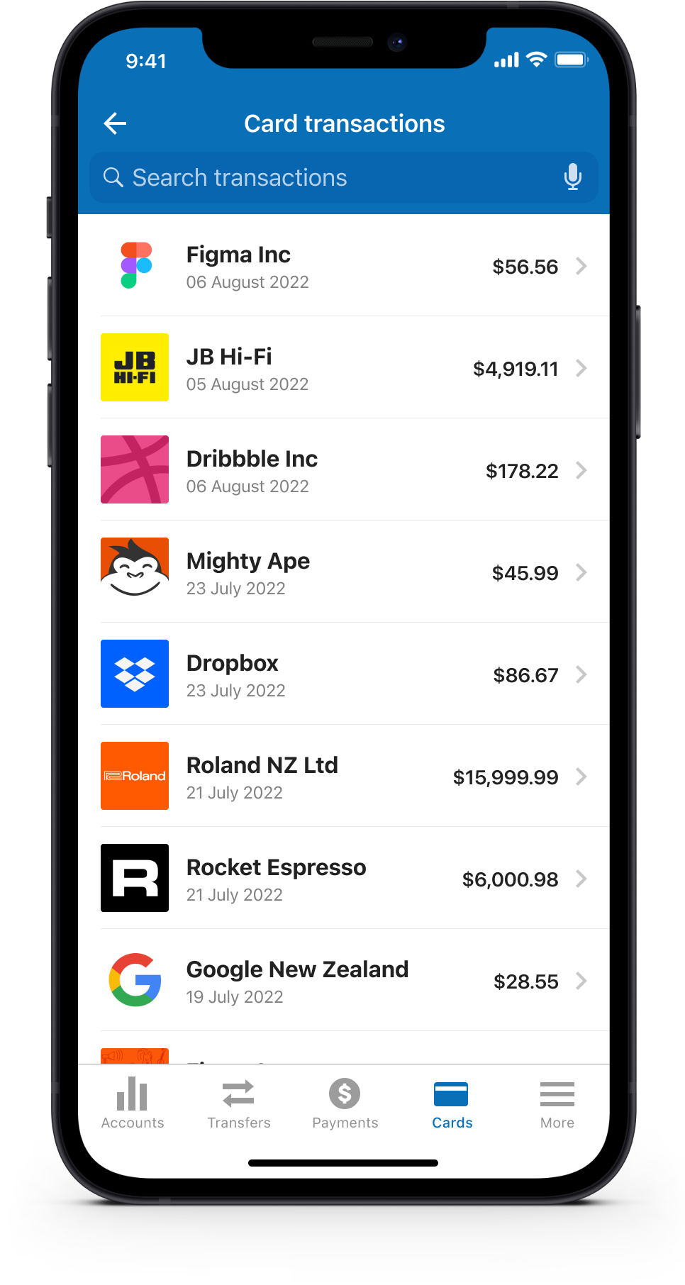
Payments and manage cards
During user research, we discovered that people pay a handful of payees they pay on a regular basis. We tried to surface favourite payees to speed up this process in the form of “Quick Payees”. We also gave people the ability to manage their cards in the event they misplace or have their wallet/purse stolen.
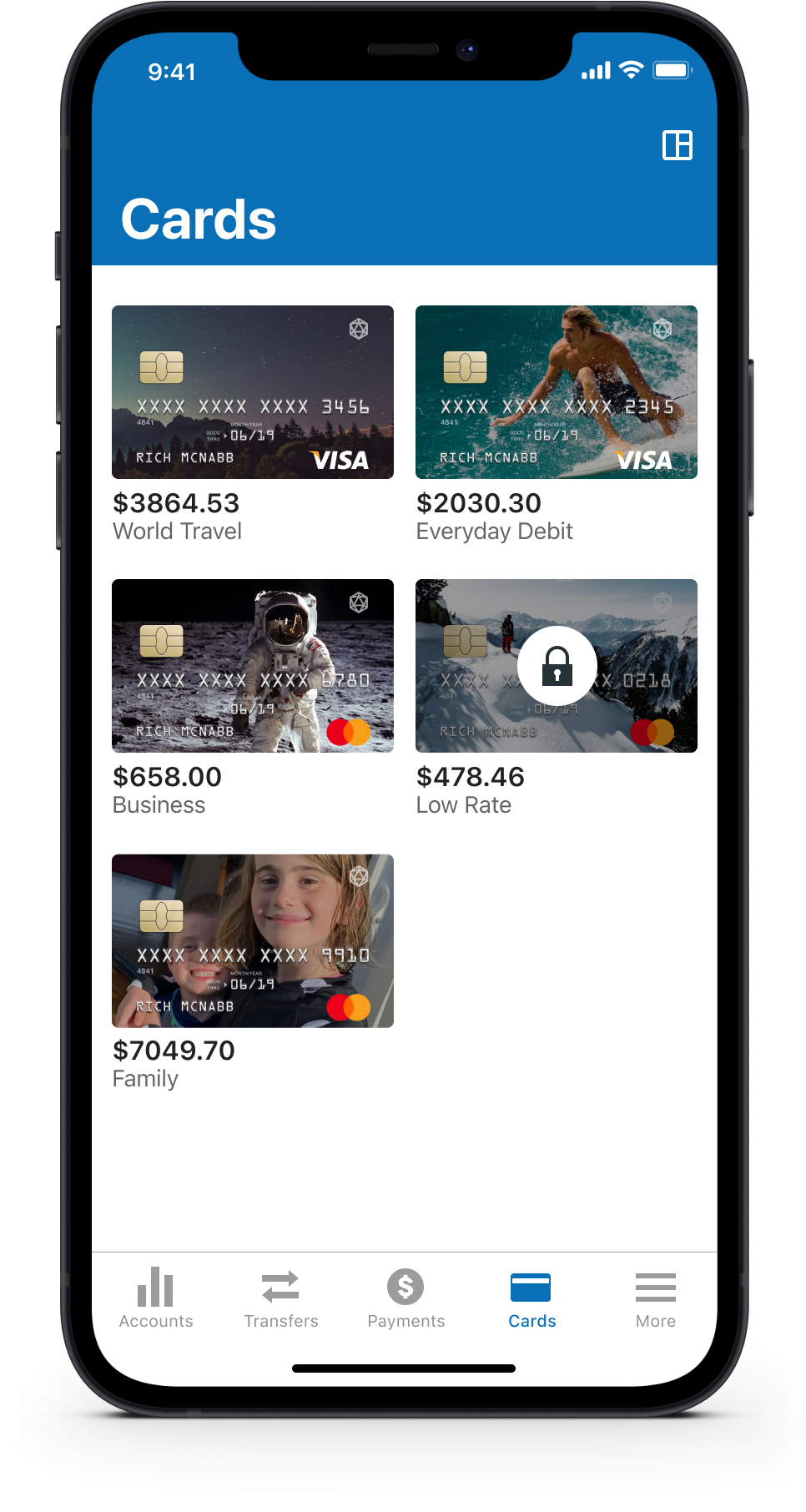
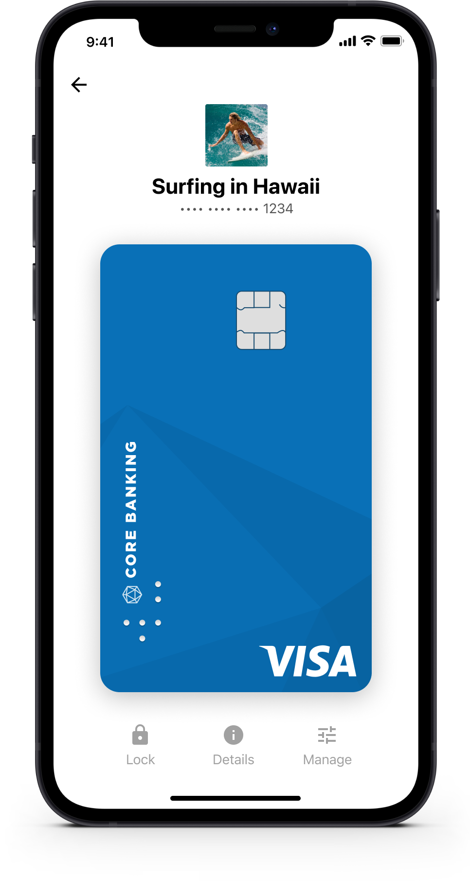
Card control and transactions
You’re in complete control of your card and finances. You can show/hide account balances and limits when you like, lock and unlock cards and other cards controls to prevent fraud and if you misplace your card.
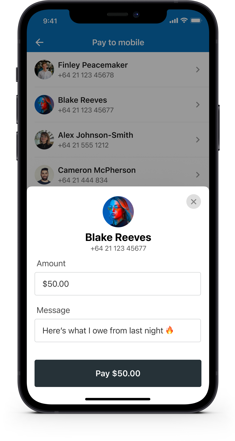
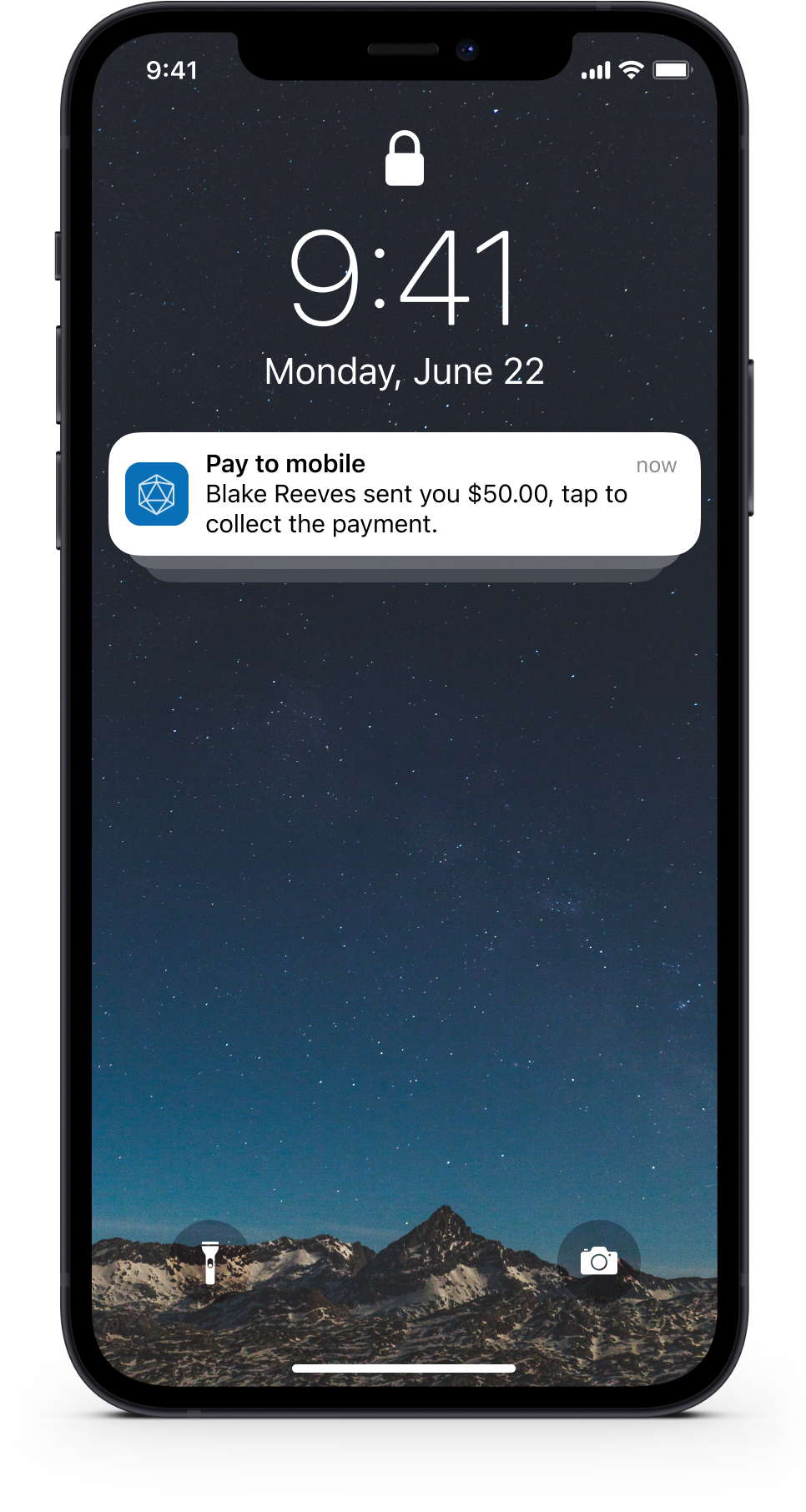
Pay to mobile
Provides the ability to send money to a mobile number for the other person to collect. This eliminates the need to know a recipient’s bank account details and allows you to send a personalised message as well.
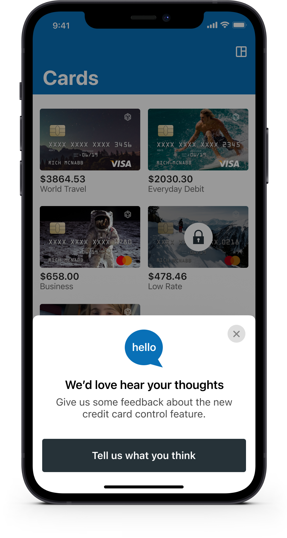
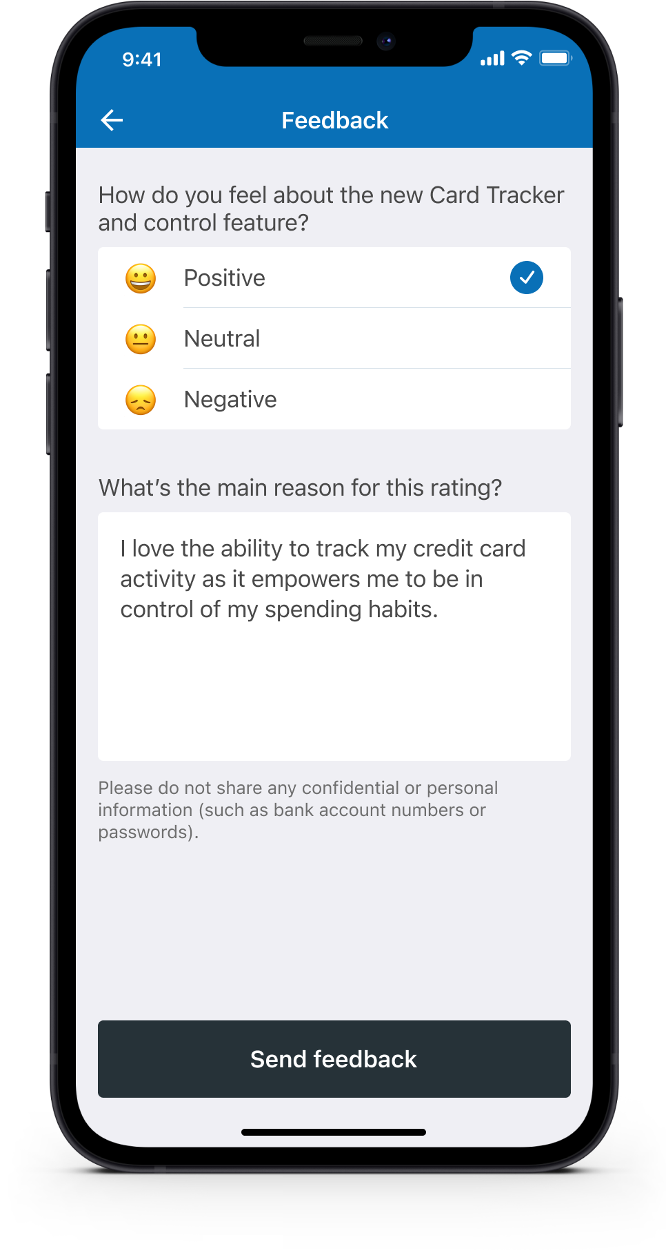
Customer feedback and metrics
To validate your assumptions and to measure how well (or poorly) you solved a customer problem you should always ask for feedback, ideally after they’ve interacted with a feature. This is an excellent way to request feedback and potentially a great way to recruit participants for usability testing.
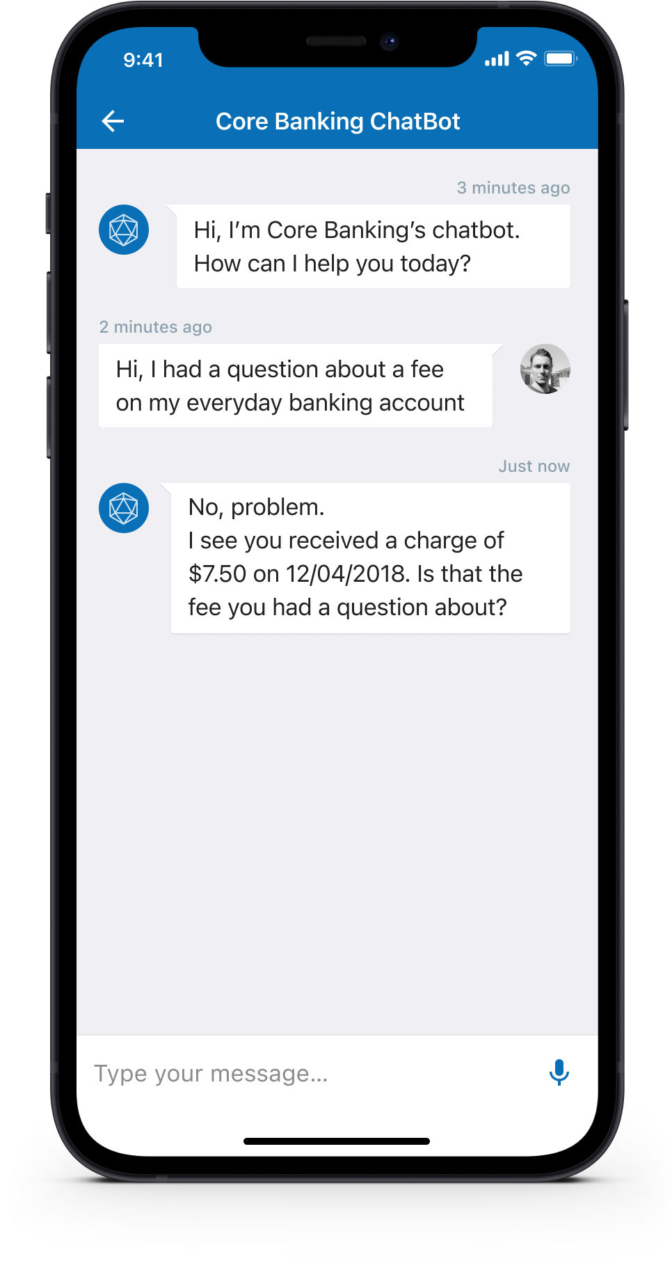
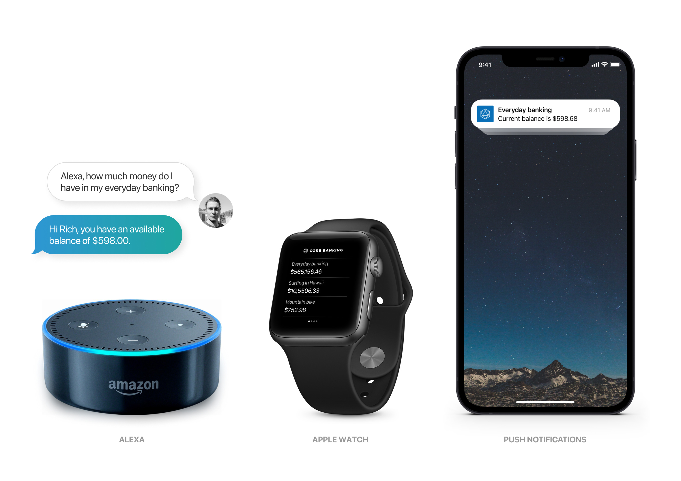
Financial Advisor in your pocket
The ability to self-serve and get answers to frequently asked questions (with context to them and their activity) helps reduce calls and emails to the bank and should hopefully reduce the time for them to get the answers they need. Also, be enabling the iOS widget users can check bank balances with a quick swipe to the right to reveal the widgets screen.
Yes, it’s available on tablet
We understand that sometimes it’s just easier on a tablet. The design system can easily stretch and grow to accommodate people who prefer to get things done on their iPad.
How much money’s in my account?
Analytics shows that 80% of the app’s activity is people simply checking their account to make sure they have enough money. I challenged myself to come up with as many concepts as I could to make the repetitive task of checking your bank balance faster and less painful. There are some clear concerns (privacy & legal) which would need to be worked through to a logical conclusion, however, it was fun to experiment.
Design system & pattern library
Every user interface component was designed using the “Atomic Design” approach recommended by Brad Frost. Elements are re-usable to speed up both the design and delivery process to ensure fast turnaround times and to get updates into the hands of users quicker.
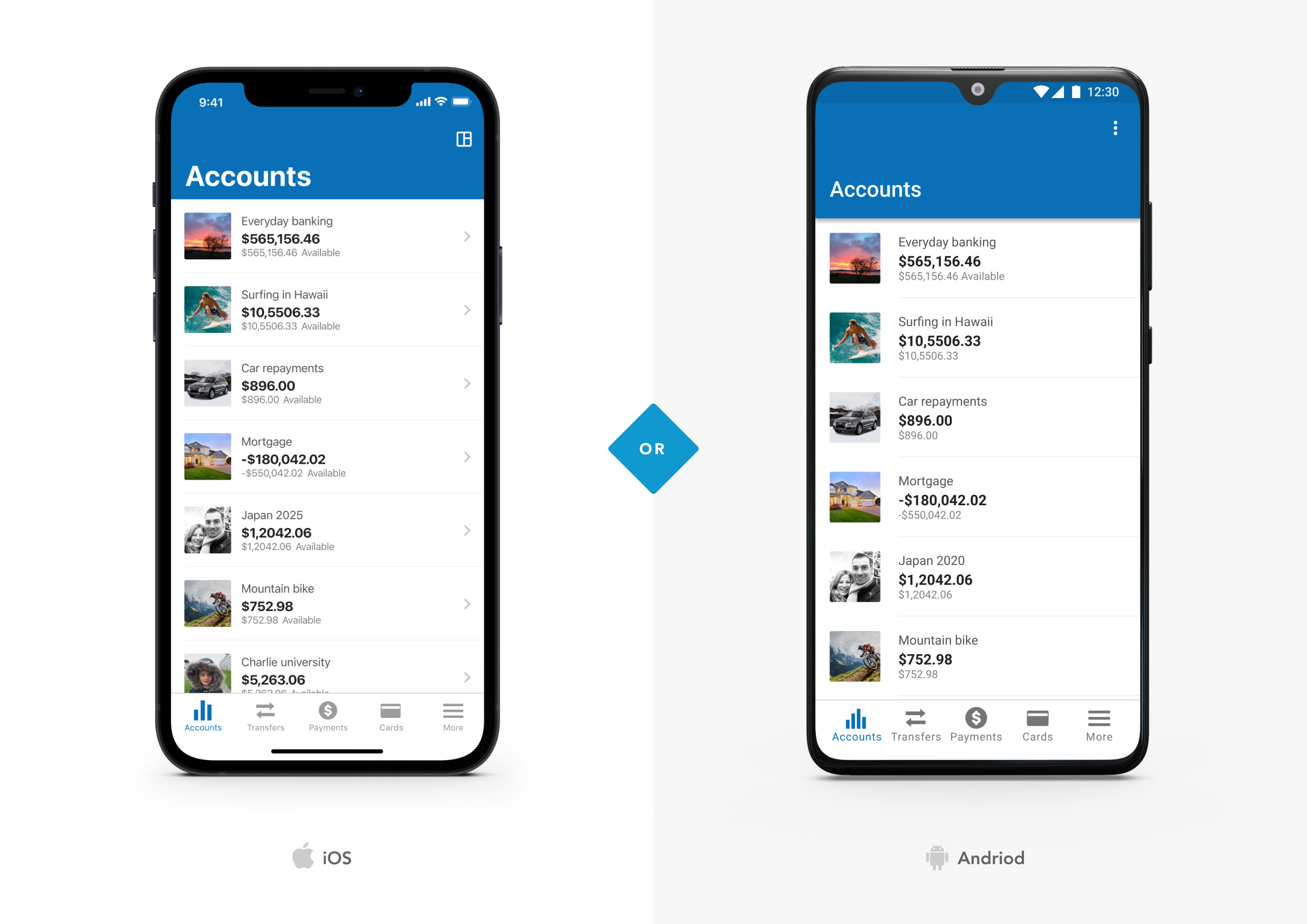
iOS & Andriod designed in harmony
When designing the app I was constantly thinking of how it was going to work/look on the wider ecosystem (e.g. iOS, Andriod and web). The fundamentals of the UI would be the same, however, we would play to the strengths of each platform and make it look and feel consistent.
Final design
Before going to launch I created a number of mock-ups of the app for the marketing team to use. The images were used in email, facebook, and twitter to help promote the new app and to increase early adoption numbers.