Sketches through to final designs
After speaking with the client to better understand their business needs and goals I like to put pencil to paper and sketch out as many ideas as I can come up with. The point isn’t to come up with different concepts and potential approaches to solve the problem. Quantity and speed over quality.
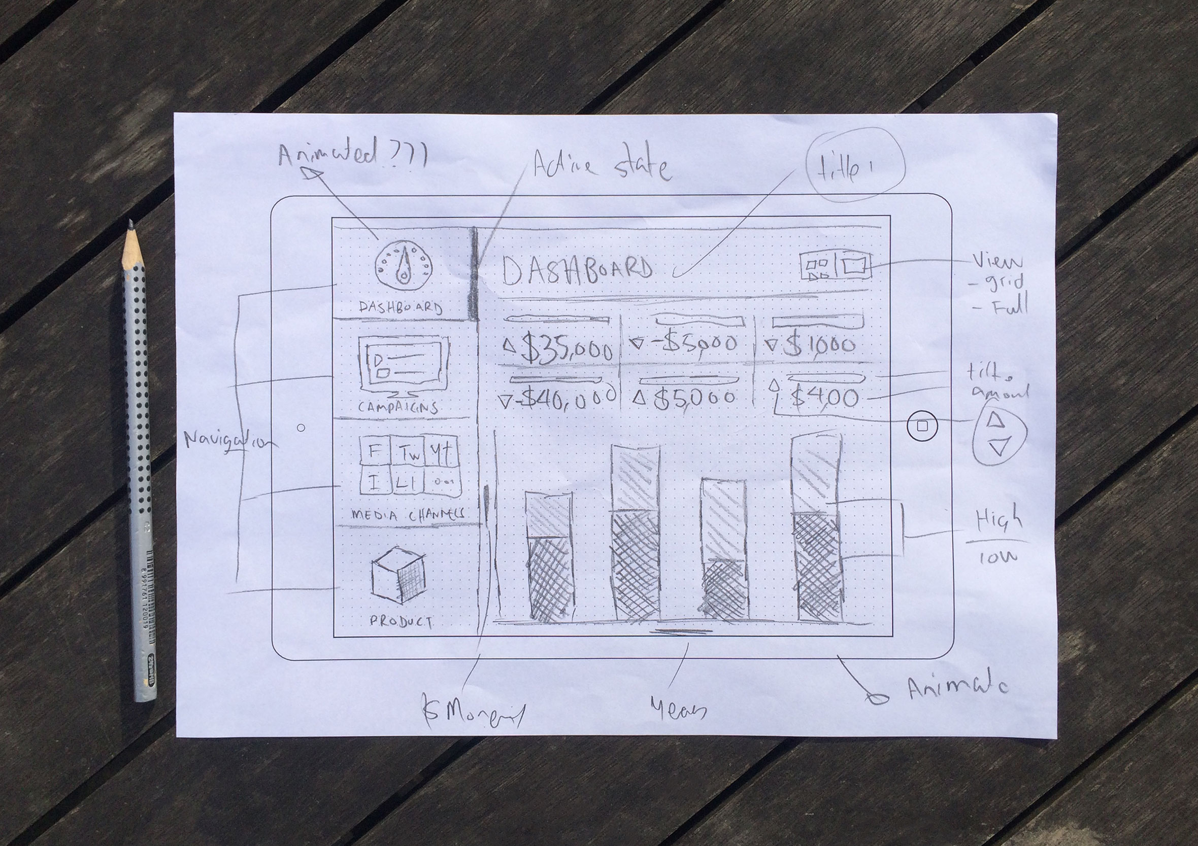
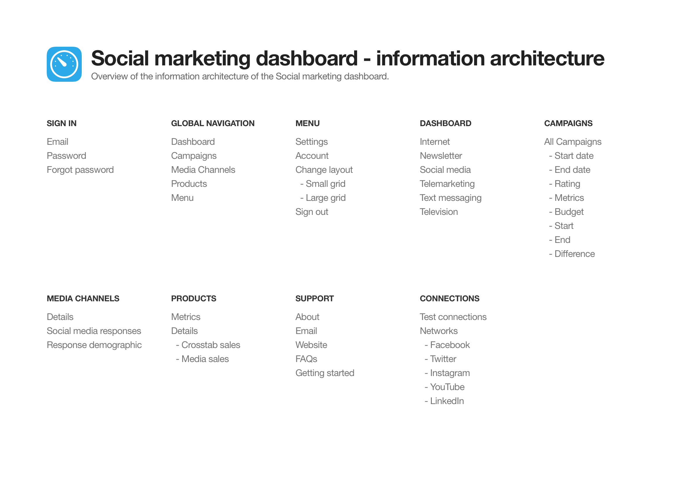
Information architecture
The information architecture maps out which screens are required and all the user interface elements which make up the structure of the app. By having everything in the one place it makes it easier to identify areas of improvements or gaps in the user experience.
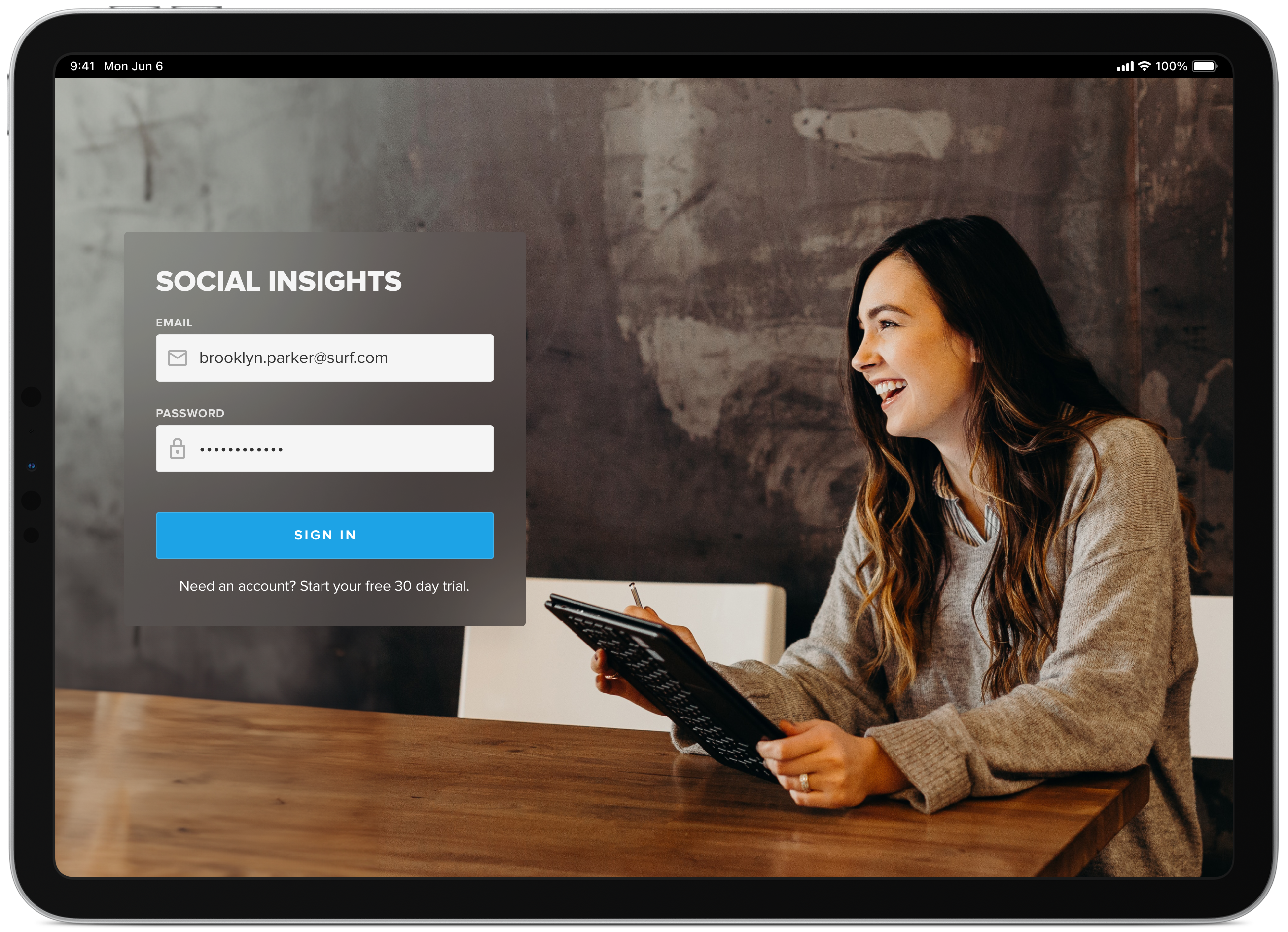
Simple sign-in screen
Like most dashboards, you’re pulling in data from various sources and displaying the information in a visual and interesting way to make the data easy to interpret and action. With that said, you want to secure and restrict who can view your data.
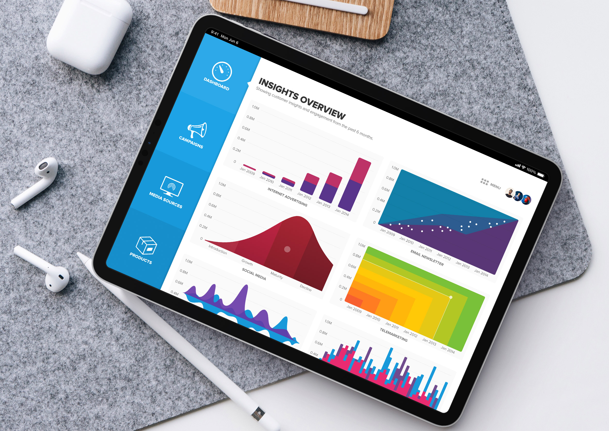
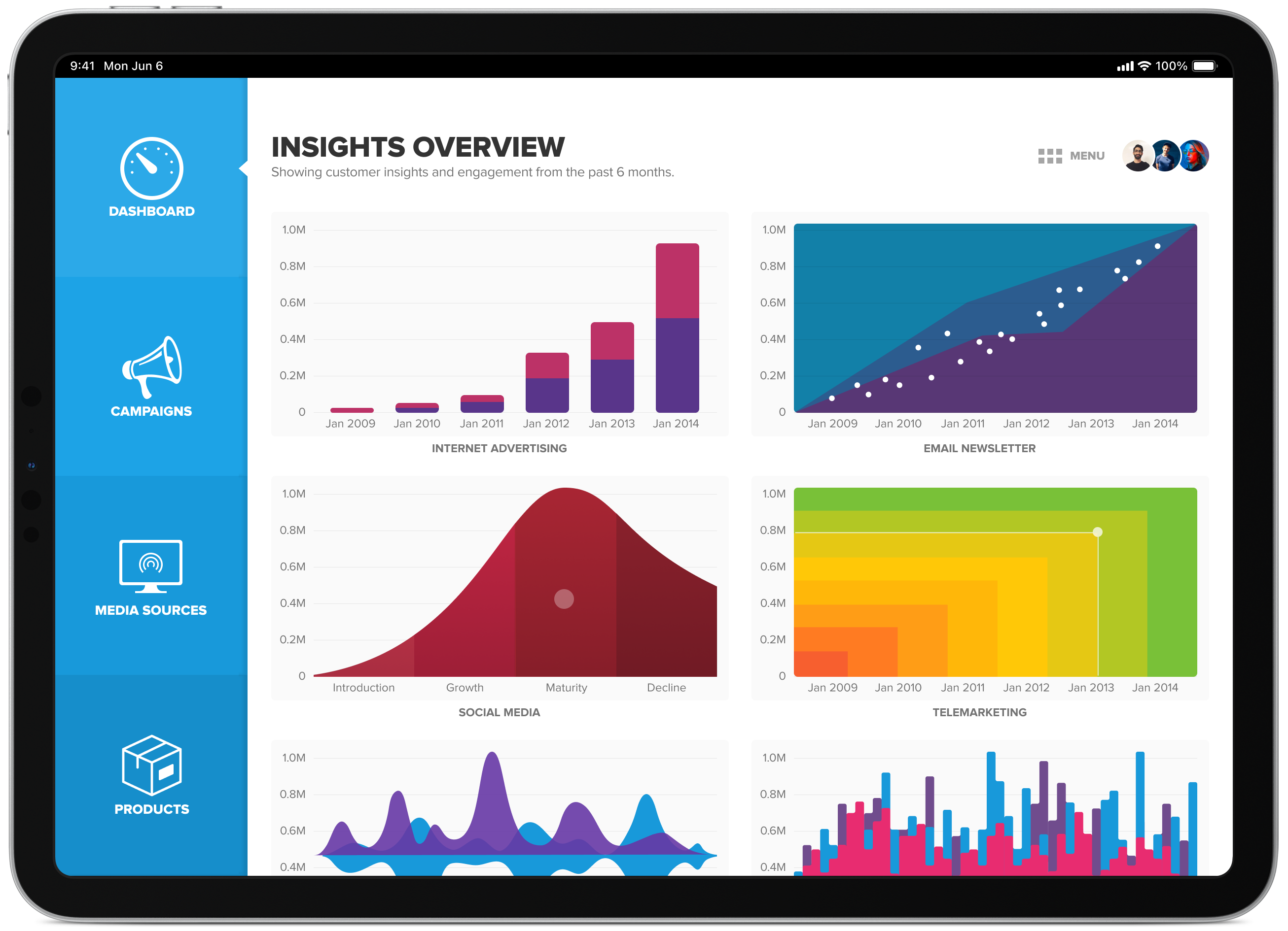
Dashboard multiple graph view
Each graph displays a miniature live preview of actual data behind that marketing campaign. When the user taps the graph thumbnail it takes them to a dedicated page and provides them with more detail and an interactive graph to help them analyse the results.
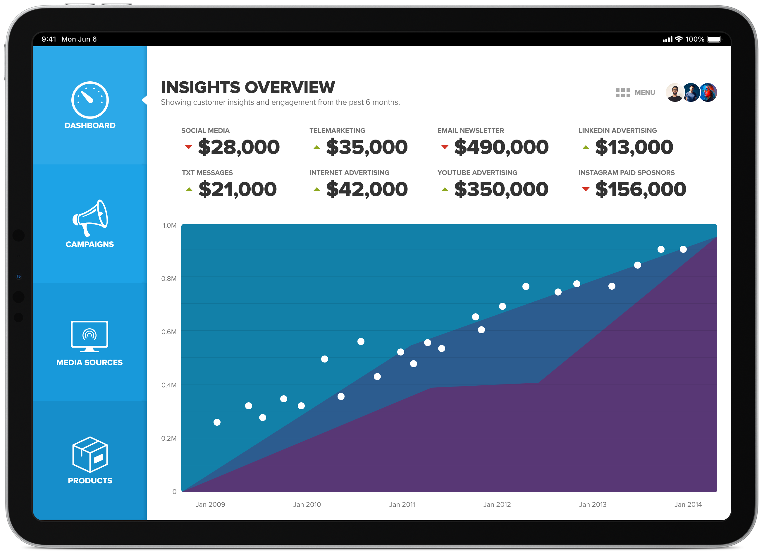
Dashboard alternative view
Like most dashboards, how effective they are, comes down to how quickly you can find the necessary information to help you make quick/well-informed decisions. The quick view provides data analytics to allow people to do just this at a high level with the ability to dive deeper if required.
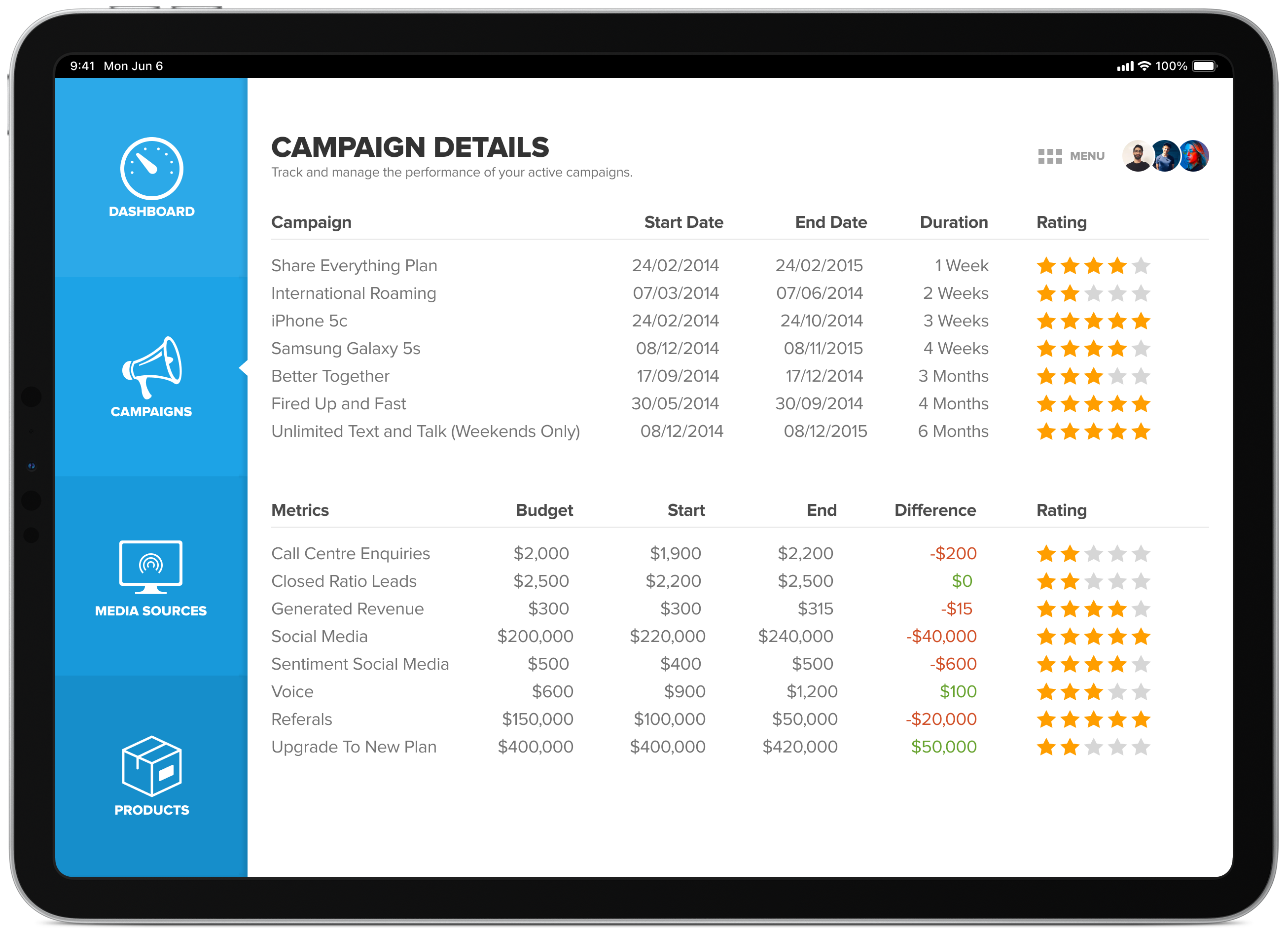
Campaign details view
Here you can view all active campaigns and get a feel for how well they’re performing. This simplified view allows you to tap on the campaign you are most interested in to bring up more detailed information about a particular event.
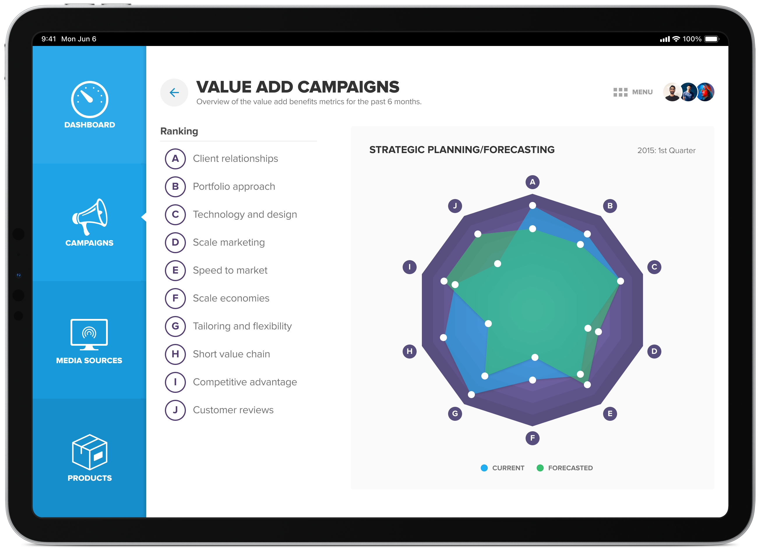
Value add campaigns
Overview of the value add benefits metrics for the past 6 months. The user can tap on the various points of the graph to bring up more information, this is true for all the graphs within this app.
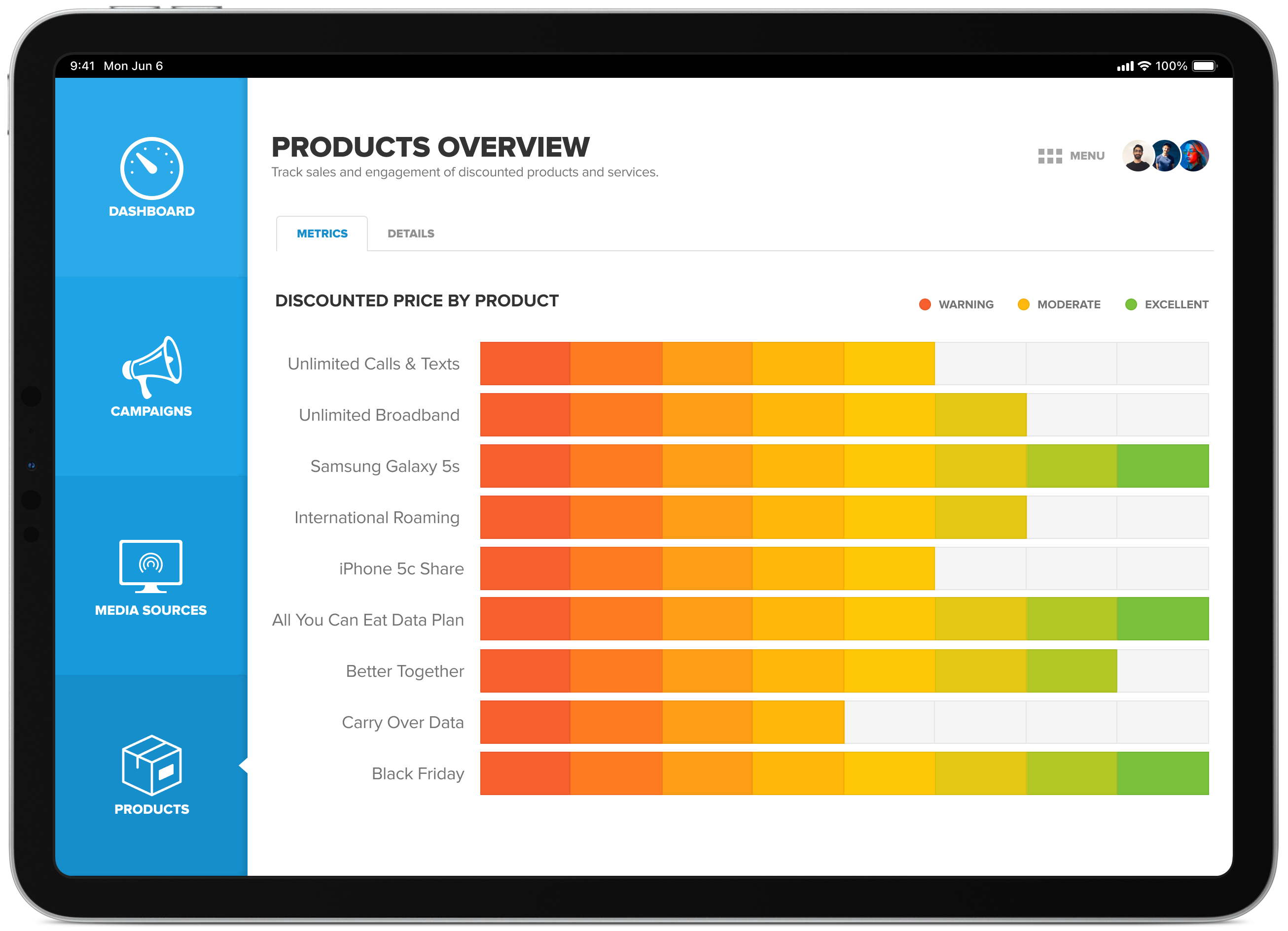
Products view
An overview of how well products are tracking after the announcement of price reductions via the 6 main media channels (social media, telemarketing, newsletter, txt, internet and television).
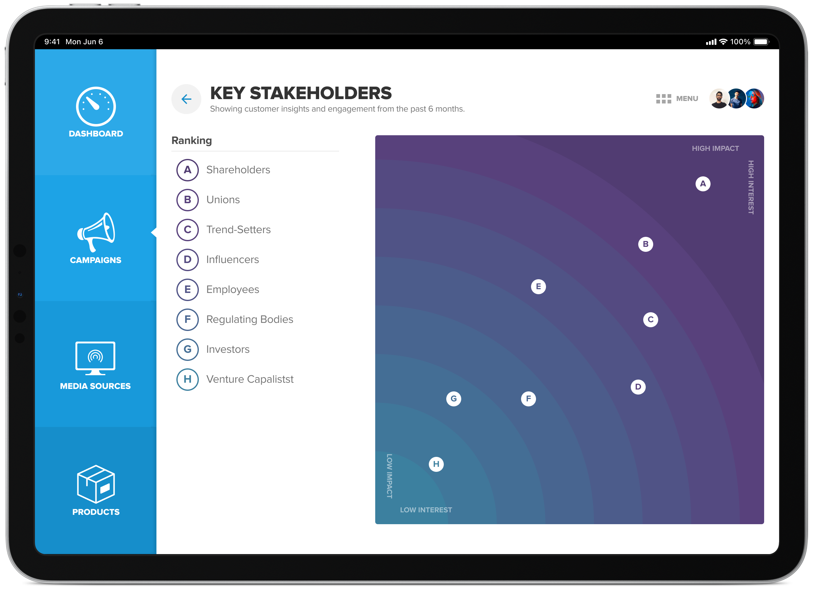
Key stakeholders view
Based on the type of campaign you run there’s going to be a difference in who is most affected/interested in the outcomes. You can use this to your advantage to mitigate any unforeseen risks and, when necessary, raise concerns to get feedback and guidance.
Experimenting with icons & colour
I experimented with various iconography treatments throughout the project to find ones which were memorable and easy to scan when navigating around the platform.


Final design
Here’s a quick mock-up of how I intend the final design to look. I find by providing clients with photorealistic mockups in context helps them to visualize how the finished product will look.